
Canadian Ecommerce Website Examples: 12 Stores to Study and What to Plan Before You Build

The best ecommerce website examples for a Canadian business are stores that sell to Canadians well: prices in Canadian dollars, clear shipping and duty information, French where the customer expects it, fast mobile pages and product pages that answer the buyer’s questions before they ask. Below are 12 Canadian online stores worth studying and what each one teaches, the factors that decide how much effort your own store takes to build, and what to plan before the build starts: catalogue, fulfilment, payments, tax, product data and the pages customers expect.

Note: Canada Create has no business relationship with the brands below. We chose them because each shows a lesson owners can apply. Store designs change often, so visit each site to see its current version.
What makes a strong ecommerce website
Before the examples, here is what we look for when we review an online store for a client:
- A clear first screen: within seconds, a visitor knows what the store sells, who it is for and why it is different.
- Navigation that matches how people shop: by category, need, size or occasion, with filters that actually narrow the catalogue.
- Product pages that remove doubt: real photos, sizing or specs, materials, delivery times, returns information and reviews.
- Canadian clarity: prices in CAD, shipping costs and times for Canadian addresses, and no surprise duties at the door.
- A short checkout: guest checkout, express wallets and as few form fields as possible.
- Speed on mobile: mobile shoppers need fast pages, so image weight and app scripts matter.
12 Canadian ecommerce websites worth studying
1. Roots: heritage storytelling that supports the product
The Toronto-founded outdoor and apparel brand shows how a long history can sell today’s products. Study how brand story, Canadian identity and product imagery work together without slowing the path to the catalogue.
2. Aritzia: editorial photography with practical fit details
The Vancouver fashion retailer is a useful example of magazine-quality imagery paired with the practical details shoppers need, such as fit notes and fabric information. Notice how the product page balances mood and facts.
3. Lululemon: explaining product technology simply
Technical fabrics and features are hard to sell online. Study how the brand turns material and fit information into short, scannable points and how it supports shoppers choosing between similar products.
4. MEC: filters for a large, technical catalogue
Outdoor gear has many specifications. MEC is a good reference for category structure and filtering when a catalogue has thousands of products that differ by size, weight, use and season.
5. Canadian Tire: online shopping connected to stores
For retailers with physical locations, study how a national chain presents store availability and pickup options alongside delivery. The lesson for smaller retailers is to make local pickup visible early, not hidden in checkout.
6. DAVIDsTEA: a bilingual store done properly
The Montreal-founded tea company is a useful reference for running an English and French store side by side. If you sell into Quebec, study how language switching, product names and descriptions are handled in both languages.
7. Kotn: transparency as a selling point
The Toronto basics brand puts sourcing and production at the centre of its story. Brands with a strong ethical or supply-chain angle can learn how to place that story on product pages, not only on an About page.
8. Mejuri: direct-to-consumer jewellery with a clear point of view
The Toronto-founded jewellery brand shows how a focused catalogue, consistent photography and a clear brand voice can make a smaller product range feel complete.
9. Knix: product education for a considered purchase
When customers need reassurance before buying, education matters. Study how the brand uses sizing guidance, comparisons and customer stories to answer the questions shoppers hesitate over.
10. Herschel Supply: clean category pages for a mid-sized catalogue
The Vancouver bag and accessories brand is a good example of tidy category pages, consistent product photography and colour variants shown without clutter.
11. Peace Collective: community and cause in a small catalogue
The Toronto apparel brand shows how a smaller store can build loyalty around community and giving, and how that message can sit next to the products without distracting from the purchase.
12. Province of Canada: made-in-Canada as the brand
For businesses whose main promise is Canadian manufacturing, this Canadian brand is a reference for making origin part of the identity and the product copy.
Patterns worth copying from these stores
- One clear promise on the home page, supported by a short line on shipping or returns.
- Category pages that load fast and filter well before they try to impress.
- Product pages written for a buyer’s doubts: fit, materials, care, delivery and returns.
- Real customer content such as reviews and photos close to the add-to-cart button.
- Bilingual content treated as a full store, not an afterthought, where Quebec customers matter.
- A brand story that appears in small doses throughout the site rather than on one page.
What drives ecommerce website cost in Canada
No two stores cost the same to build, because the effort comes from a handful of decisions. Use this table to see where your project sits before you ask for quotes.
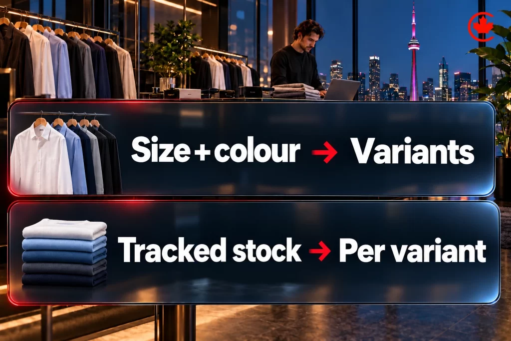
| Cost driver | Lower effort | Higher effort |
|---|---|---|
| Platform | Shopify with a premium theme | Custom WooCommerce, headless or enterprise platform |
| Design | Theme adjusted to your brand | Fully custom design and interactions |
| Catalogue size | Under 100 products, simple variants | Thousands of products, complex variants and bundles |
| Languages | English only | English and French with full content in both |
| Integrations | Payments and shipping only | ERP, POS, warehouse, CRM and accounting systems |
| Pricing model | One retail price | B2B tiers, wholesale accounts, subscriptions |
| Migration | New store, no history | Moving products, customers, orders and URLs from another platform |
| Content | Supplied photos and product copy | New photography, product writing and SEO content |
We plan, build and optimize e-commerce stores on WooCommerce and Shopify for Canadian sellers.
Two things are often missed in early budgets. The first is ongoing cost: platform plan, paid apps, payment processing, hosting for WooCommerce and maintenance. The second is the work after launch: product SEO, email flows, paid ads and conversion improvements usually decide whether the store grows.

Shopify or WooCommerce for a Canadian store?
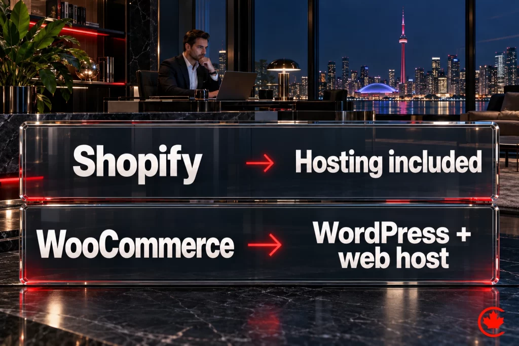
Shopify is a practical choice for Canadian stores seeking hosted checkout and infrastructure, tax calculation tools and a broad app ecosystem. Merchants still need correct tax settings, registrations and filings, plus secure accounts and appropriate app access. WooCommerce, which runs on WordPress, makes sense when content and SEO drive sales, when you need unusual product logic, or when you want full control of the code and data. We compare the two in detail in Shopify vs WooCommerce for Canadian stores.
Canadian details your store needs
- Sales tax: GST, HST, PST, QST and RST depend on registration obligations, what you sell and place-of-supply rules. Configure the platform for your actual obligations; shipping destination matters for many physical-goods orders.
- Shipping: show rates and delivery times for Canadian addresses early, and be clear about remote and northern delivery.
- Cross-border orders: if you ship to the US, explain who pays duties and taxes before checkout.
- Privacy and consent: Identify the federal and provincial privacy laws that apply to your business. Alberta, British Columbia and Quebec have substantially similar private-sector laws; PIPEDA can still apply to cross-border commercial handling of personal information.
- Email marketing: CASL generally requires express or qualifying implied consent, sender identification and an unsubscribe mechanism for marketing emails. Record the basis and duration of consent.
- French content: a legal requirement where Quebec’s language rules apply, not just a customer preference. Plan a complete French shopping experience and confirm how the rules apply to your business.
- Accessibility: Ontario’s designated public-sector organizations and businesses or non-profits with 50 or more employees must meet the applicable public-website WCAG 2.0 Level AA requirements, with specified exceptions.
What to plan before building an ecommerce website
Before building an ecommerce website, plan for four things in order: your product catalogue structure and how it will grow, your payment and shipping logistics for Canadian and cross-border orders, your platform choice based on catalogue size and growth plan, and your content and SEO foundation so the site can actually be found once it launches. Missing one of these decisions can create avoidable rework after launch.
Why planning comes before the platform
Jumping straight to “build me a Shopify store” without answering these planning questions can produce a site that looks fine on launch day and then fights the business as its catalogue and operations grow. Getting the planning right first decides whether the build holds up, whichever platform it lands on.
Planning is cheapest before the first product description is written. Once a store is live, missed catalogue, integration or fulfilment requirements turn into rework on pages, data and checkout at the same time.
Signs your store needs a planning stage first
A few concrete signals tell you it is time to sit down and plan properly, rather than jumping straight into a build:
- You have a large catalogue planned at launch, or you expect rapid catalogue growth. Catalogue size affects navigation, data imports and operations. A 20-product catalogue and a 2,000-product catalogue may use the same platform, but variants, integrations and fulfilment complexity can change the implementation.
- You will ship both within Canada and cross-border. Orders shipped outside Canada need different tax handling and carrier integrations than domestic ones. If that gap surfaces after launch instead of during planning, it delays the store while the setup is fixed.
- You are planning to accept more than one payment method beyond basic credit card. Interac, Apple Pay, Buy Now Pay Later options like Affirm or Sezzle all require confirming platform compatibility before you pick a platform, not after.
- Nobody on your team has mapped the actual order fulfilment workflow yet. If you cannot describe, step by step, what happens between “customer clicks buy” and “package leaves the warehouse,” the website build is premature.
Common planning mistakes
A common mistake is choosing the platform before mapping the catalogue and fulfilment needs. Owners see a friend’s Shopify store, like the interface, and commit before checking whether Shopify’s shipping rate calculator actually works well for their specific carrier mix, or whether WooCommerce’s flexibility might serve a more complex product configuration better. Platform-first thinking is backwards. Catalogue and fulfilment complexity should help decide the platform, alongside budget, integrations and the team’s operating needs.

The second mistake is underestimating the content and SEO planning needed before launch. A store with beautifully photographed products still needs useful product information, navigable categories and a plan for genuine reviews so shoppers and search engines can understand it. Google’s guidance on ecommerce SEO explains how product data, content and site structure help Google find and understand a store. Our ecommerce SEO services can plan categories, product content and redirects before launch.
A five-step planning checklist
| Task | What you do | Why it matters |
|---|---|---|
| Map your catalogue structure | List categories, variants, and expected SKU growth over 12 months | Determines whether you need a simple or complex platform |
| Document your fulfilment workflow | Write out every step from order to delivery, including returns | Surfaces integration needs before you commit to a platform |
| Confirm payment and tax requirements | List required payment methods and applicable Canadian and cross-border tax rules | Avoids a mid-build platform swap |
| Draft your content plan | Outline product description approach, category copy, and review collection process | Supports search discovery at launch |
| Set a realistic budget range | Model both build cost and first-year operating cost together | Keeps platform and design choices grounded in reality |
Completing this five-step exercise gives providers a clearer basis for quotes and schedules. Gaps discovered after approval can require change orders, so resolve the costly unknowns before committing to a build.
Canadian tax, payment and shipping details to settle early
Sales tax in Canada depends on where the customer receives the order. Provinces with HST charge one combined rate, others charge GST plus a provincial sales tax, and Quebec has its own QST. Your platform has to apply the right rate for each destination, and your accountant should confirm when you need to register for GST/HST and for any provincial taxes before the first sale.
Payment choices also shape the build. Confirm that your payment processor settles in Canadian dollars, which card types and wallets it supports, how Interac payments are handled, and how long payouts take to reach your bank. Each additional method, such as a buy now, pay later option, adds setup, testing and fees to review.
For shipping, decide which carriers you will use, whether rates are flat, tiered or calculated live, and how you will handle remote and northern addresses, where delivery times and costs differ. Live rate calculation only works if every product has an accurate weight and dimensions, which brings us to product data.

Product data and photography before the build
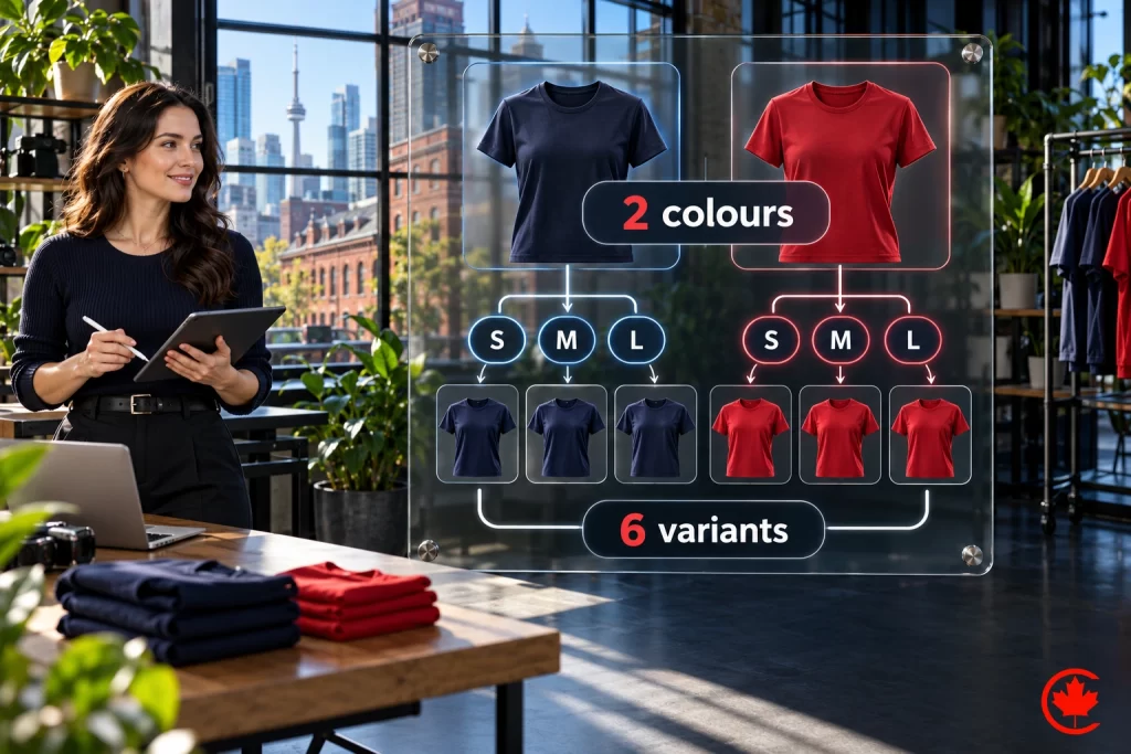
A store is only as good as the product information loaded into it. Before design starts, build a product spreadsheet with one row per product and variant: SKU, name, category, price, options such as size and colour, weight and dimensions, stock level, and a barcode or GTIN where the product has one. This file becomes the import for the new store and quickly shows gaps that would otherwise surface during development.
Plan photography with the same care. Use a consistent background, angle and lighting across each category, include close-ups of details and a shot that shows scale, and name files clearly so they can be matched to products. Consistent images make category pages look organized and make it easier to add new products later without a new shoot style.
Policies and pages customers expect
Shoppers look for practical information before they buy, and missing pages create emails and abandoned carts. Prepare the content for these pages during planning, not in the week before launch:
- Shipping information: where you ship, carriers, delivery times and how costs are calculated.
- Returns and exchanges: time limits, condition of items, who pays return shipping and how to start a return.
- A privacy policy that explains what personal information the store collects and why, in line with Canadian privacy law.
- Contact details and the hours when someone answers.
- Product care, sizing or compatibility guides where shoppers often have questions.
Decide at the same time how checkout will ask for marketing consent. Under CASL, a separate, unticked opt-in for promotional email is the clearest approach. If you sell to customers in Quebec, plan French versions of product information and these pages from the start.
Ecommerce website elements to test first
Product photography that shows real scale and context
Generic product photos on a white background are table stakes, expected but not differentiating. A useful test is to include at least one photo showing the product in genuine use or in context, a piece of furniture in an actual room setting, a piece of jewellery on a real person rather than a mannequin. For a home-goods store, compare add-to-cart rates before and after adding room-setting photos, using comparable products and accounting for changes in traffic, price and promotions.
Shipping costs shown before checkout
Shipping costs that appear only at the final checkout step are a common reason shoppers abandon a cart. Show shipping costs, or at minimum a clear shipping policy, well before the final checkout screen, ideally on the product page itself. For an apparel store, test an estimated shipping calculator on the product page so customers can assess the delivered cost before checkout.

Genuine customer reviews on the product page, not buried
Reviews shown directly on the product page, not on a separate tab that needs an extra click, let shoppers see proof without extra effort. Test a placement close to the main product images and price, and compare product-page conversion and return rates. Use genuine reviews without screening out negative feedback.
A search that understands typos and synonyms
Test whether your store’s search handles typos and synonyms. A customer searching “sweatshirt” should be able to find a relevant “hoodie” even when the words differ. Synonym-aware search tools can address those gaps; measure zero-result searches and search-assisted purchases, while recognizing that search users may already have stronger buying intent than other visitors.

A checkout designed for phones, not just responsive
A responsive design that simply shrinks a desktop checkout flow onto a mobile screen is not the same as a checkout genuinely designed for mobile use, larger tap targets, autofill-friendly form fields, and a minimized number of steps. Review each mobile checkout step, remove unnecessary fields and support autofill where appropriate. Measure mobile conversion rate and payment errors to see whether the changes improve the purchase journey.

Elements that sound important but move less
Free shipping badges without a threshold strategy
A generic “free shipping” badge across a site, without a thought-out threshold, can quietly cost more than the extra sales it brings. Test a free-shipping threshold slightly above average order value, then check contribution margin after product costs, shipping and returns. A larger basket helps only if the extra margin covers the subsidy.
Live chat widgets
Use live chat where shoppers have questions that a timely answer can resolve, particularly for considered purchases. Check staffing, response time and assisted sales before making it a default feature on every store.
Countdown timers and urgency banners
Artificial urgency tactics, countdown timers on sales that do not actually end, “only 2 left in stock” messaging that is not genuinely accurate, can produce a short-term bump but damage trust once customers notice the tactic is not honest, and repeat visitors notice quickly. Use urgency messaging only when it reflects a real, verifiable constraint.
Ecommerce features compared
| Element | Suggested testing priority | Effort to implement |
|---|---|---|
| Lifestyle product photography | High | Moderate |
| Upfront shipping transparency | High | Low |
| On-page reviews | High | Low to moderate |
| Synonym-aware site search | Moderate to high | Moderate |
| Mobile-specific checkout redesign | High | High |
| Live chat | Low to moderate, situational | Low |
| Artificial urgency banners | Avoid deceptive claims | Low |
Trust signals that matter more than you might assume
Beyond reviews, several trust elements are worth testing for newer or lesser-known ecommerce brands. A clearly visible return policy summary directly on the product page, not buried three clicks away in a footer link, reduces pre-purchase hesitation for customers who have never bought from the brand before. Accurate security and payment information near checkout can reassure first-time buyers. Display only badges you are authorized to use and that reflect the store’s actual services or controls.
A visible, real customer service contact method, a phone number or live chat with an actual response time commitment, rather than only a contact form with no stated response expectation, also gives shoppers a way to resolve concerns before buying. Customers hesitating over a purchase decision often want reassurance that a real person is reachable if something goes wrong, even if they never actually end up contacting support.
Page speed on an online store
Slow product and checkout pages can interrupt a purchase. Measure page performance alongside funnel drop-off to identify where technical delays are affecting shoppers. Prioritize appropriately sized, compressed product images and lazy-load images below the initial viewport. Do not lazy-load the main image if it is the page’s Largest Contentful Paint element.

Before a seasonal promotion, check image delivery and test the store under expected traffic. Compare loading times, checkout errors and completed orders during the sale, accounting for changes in demand and the offer before attributing revenue to a technical change.
Ready for the platform and design decision
Once you have mapped your catalogue, fulfilment and content plan, you are ready for the platform and design conversation itself. Our ecommerce website design and development in Toronto page explains how we build stores for Canadian businesses. If you have already narrowed your options down to Shopify or WooCommerce specifically, our companion comparison on Shopify versus WooCommerce for a Canadian store breaks down the ongoing cost difference in detail.

How to plan your own store
- List your top three competitors and two stores from this article you admire, and write down what each does better than your current site.
- Decide your platform based on catalogue, integrations and how much content drives your sales.
- Map your categories and filters the way your customers shop, not the way your inventory system is organized.
- Write one excellent product page first and use it as the template for the rest.
- Plan the launch work: tracking, product SEO, email flows and the first ad campaigns.
The planning section above goes deeper on each step. When you are ready for a store built around how your customers buy, our ecommerce website team designs and builds Shopify and WooCommerce stores for Canadian businesses, with ecommerce SEO to bring in the traffic after launch.
Frequently asked questions
What sets the price of an ecommerce website build in Canada?
It depends on a handful of decisions rather than a set price. Shopify with an adjusted premium theme, fewer than 100 products and English only sits at the lower-effort end, while custom WooCommerce, thousands of variants, full English and French content, ERP or POS integrations, wholesale pricing and a migration push the effort up. Once the catalogue and integrations are known, Canada Create sends a written quote after a free consultation.
How much does it cost to maintain an ecommerce website after launch?
Ongoing costs are often missing from early budgets. Expect a platform plan, paid apps, payment processing fees, hosting if you run WooCommerce, and regular maintenance. The work after launch, such as product SEO, email flows, paid ads and conversion improvements, usually decides whether the store grows, so plan for it alongside the build.
What can a small business learn from Canadian ecommerce website examples?
The strongest stores repeat a few patterns. They state one clear promise on the home page with a short line on shipping or returns, keep category pages fast with filters that work, and write product pages around the buyer's doubts about fit, materials, care, delivery and returns. Reviews and customer photos sit close to the add-to-cart button.
How can a simple ecommerce website with a small catalogue still feel complete?
A focused range, consistent photography and a clear brand voice do most of the work, which is what Mejuri shows with jewellery. Smaller stores can also build loyalty around community or a cause, as Peace Collective does, as long as that message sits beside the products without distracting from checkout. Tell the brand story in small doses across the site rather than on one page.
Is there one best ecommerce platform for every Canadian business?
No single platform fits every store, so decide on catalogue, integrations and how much content drives your sales. Shopify suits sellers who want hosted checkout, tax calculation tools and a broad app ecosystem. WooCommerce on WordPress makes sense when content and SEO bring sales, when product logic is unusual, or when you want full control of the code and data.
Which sales taxes do ecommerce sites in Canada need to set up?
GST, HST, PST, QST and RST can all apply, depending on your registration obligations, what you sell and place-of-supply rules. For many physical goods, the shipping destination decides which tax is charged. Configure the platform for your actual obligations and confirm them with your accountant, since the store's tax tools only work with correct settings.
What sets the best ecommerce websites in Canada apart?
They sell to Canadians well rather than chasing flashy design. Prices appear in Canadian dollars, shipping costs and delivery times for Canadian addresses show early, duties never surprise anyone at the door, and French is there where customers expect it. Fast mobile pages and a short checkout with guest checkout and express wallets finish the job.
Does an ecommerce website in Canada need French content and accessibility features?
French is a legal requirement where Quebec's language rules apply, so plan a complete French shopping experience and confirm how the rules affect your business. In Ontario, organizations with at least 50 employees in the province must meet the applicable WCAG 2.0 Level AA website requirements, with specified exceptions. DAVIDsTEA is a useful reference for running English and French side by side.
Where should a new ecommerce business start before picking a platform?
Map the catalogue and the order fulfilment workflow first. If you cannot describe each step from a customer clicking buy to the package leaving the warehouse, the website build is premature. Choosing a platform because a friend's store looks good, before checking carriers and product configuration, is a common mistake.
What are the major steps in planning an ecommerce website project?
Map your categories, variants and expected SKU growth over the next 12 months, then write out every fulfilment step, including returns. Confirm your payment methods and the Canadian and cross-border tax rules that apply, and draft a content plan for product descriptions, category copy and review collection. Finally, set a budget range that covers both the build and ongoing costs.
What product data should be ready before an ecommerce build starts?
Build a spreadsheet with one row per product and variant listing the SKU, name, category, price, options such as size and colour, weight and dimensions, stock level and a barcode or GTIN where one exists. That file becomes the import for the new store and exposes gaps before development. Accurate weights and dimensions also make live shipping rates possible.
Which payment details should you confirm with an ecommerce developer before the build?
Confirm that payouts arrive in Canadian dollars, which cards and wallets it supports, how Interac payments work and how long payouts take to reach your bank. Buy now, pay later options and other extra methods need their platform compatibility confirmed before you choose a platform. Each one adds setup, testing and fees.
Which policy pages should ecommerce websites have ready at launch?
Prepare shipping information, a returns and exchanges policy, a privacy policy that fits Canadian privacy law, and contact details with the hours someone answers. Sizing, care or compatibility guides help where shoppers often hesitate. Plan a separate, unticked opt-in for promotional email under CASL, and French versions of these pages if you sell to Quebec.
What trust signals should an ecommerce website display?
Show a short return policy summary on the product page instead of hiding it in the footer. Place accurate security and payment information near checkout, and display only badges you are authorized to use. Give shoppers a real way to reach a person, such as a phone number or live chat with a stated response time. First-time buyers often want to know help exists even if they never use it.
Where should an online store show shipping costs?
Show them well before the final checkout screen, ideally on the product page. Shipping costs that appear only at the last step are a common reason shoppers abandon their carts. An estimated shipping calculator on the product page lets customers see the delivered price early. At minimum, link a clear shipping policy from product pages.
Why does site search matter on a good ecommerce website?
A shopper who types into the search box usually has a product in mind, and a failed search can end the visit. Test whether your search copes with typos and synonyms, for example whether someone typing sweatshirt finds a hoodie. Track zero-result searches and purchases that started with a search. Keep in mind that searchers may already be keener buyers than average.
What makes a mobile checkout work well on an online store?
A phone checkout should be designed for phones rather than shrunk from the desktop version. That means larger tap targets, form fields that support autofill and as few steps and fields as possible. Go through each step on a real device and remove anything unnecessary. Watch mobile conversion rate and payment errors to see whether the changes help.