
Toronto · Newsletter template design
Email newsletter design in Toronto
A tested newsletter template built inside your own email platform, with sections your team can reorder and a one page guide so every issue looks like your brand.
Newsletter templates for Toronto and the GTA and organizations across Canada: modular sections, mobile first layout, live text, dark mode checks, a compliant footer and a guide your staff can follow.
- BBB A+ accredited
- 18 years in business
- Mon to Fri 9 to 6, Sat 10 to 2
Get your newsletter template review
Forward a recent issue and tell us which email platform you use. We reply within one business day.
Please do not share passwords or other sensitive details here. We never sell your contact information and we comply with Canadian privacy law
(privacy policy).
What your newsletter gets
Issues built in less effort
Staff stack ready sections instead of rebuilding a layout every time.
A newsletter that reads on phones
A single column design that stacks cleanly and keeps type readable without zooming.
Brand consistency
Logo, colours, fonts and buttons set once so every issue matches the website and print.
Fewer display surprises
Sections checked in dark mode, with images off and in the common email apps before handover.
What newsletter template design includes
Each project is scoped in your written proposal; these are the pieces many newsletter templates contain.
- Master templateHeader, sections and locked footer built inside your own email platform.
- Modular sectionsLead story, short items, events, cards, story block and a single main button.
- Mobile first layoutA single reading column that stacks two column sections on phones.
- Accessible designLive text, alt text slots, checked colour contrast and descriptive button labels.
- Dark mode versionsLogo and panel colours adjusted so sections stay readable when apps darken them.
- Compliant footerSender identification, mailing address, unsubscribe and preference link in every issue.
- Plain text versionA readable text version that follows the order of the designed email.
- Library and staff guideSaved sections, sample layouts and a one page guide for whoever builds each issue.
How newsletter template design is priced
Every template is quoted in writing after a free review. Your email platform subscription is paid to the platform and shown separately.
Starter template
Quoted in writing
A simple monthly newsletter in one language
- Master template
- Core sections
- Locked footer
- App and phone testing
Modular library
Quoted in writing
Teams sending several kinds of email
- Full section library
- Three sample layouts
- Dark mode checks
- One page staff guide
Bilingual template
Quoted in writing
Organizations writing in English and French
- Paired English and French layouts
- Longer text testing
- Bilingual footer
- Guide in both languages
Template refresh
Quoted in writing
Existing templates that break or look dated
- Rendering review
- Accessibility fixes
- Footer update
- Rebuilt sections
Ad spend and software licences are paid to the platform directly and shown separately from our fees.
Newsletter design guide
What a newsletter template needs and how to choose a designer
Email newsletter design is the work of building the template your newsletter is sent in: the header, the sections, the type, the buttons, the footer and the rules that keep every issue looking like your brand on a phone, a laptop and a work inbox. It is for owners, marketing coordinators and communications staff who send a regular newsletter and are tired of fighting a layout that breaks, a logo that vanishes in dark mode or a template only one person knows how to edit. Canada Create is a Toronto agency at 126 Willowdale Avenue that designs newsletter templates for businesses and organizations across Canada, built inside the email platform you already pay for and handed over so your own staff can build each issue.
- What a newsletter template has to do
- Modular sections your team can reorder
- Mobile first layout and readable type
- Live text, alt text and contrast
- Dark mode and images that load quickly
- The header, the footer and the plain text version
- Testing across email apps and phones
- A template library and a guide for staff
- How the template fits the rest of your email work
- Consent, privacy and accessibility rules
- How we design your newsletter template
- What newsletter template design costs
- How to choose a newsletter designer
- Book an email newsletter design consultation in Toronto
What a newsletter template has to do
People searching for newsletter template design or HTML email design usually have one of three problems. The newsletter looks fine on the designer’s screen and falls apart on a phone. Each issue takes a full afternoon because someone rebuilds the layout from scratch. Or the newsletter looks nothing like the website, the signage or the brochure, because it was started from a generic starter template years ago and never touched again. A designed template solves all three by making the layout a fixed, tested frame and leaving only the content to change from issue to issue.
Design for the reader who skims
Many readers glance at a newsletter in the few seconds between other tasks. The template has to make that glance useful: a clear sender name, a subject that matches the top of the email, one lead story that is obvious at a glance, short items below it, and a single main button that says exactly what happens when it is tapped. A layout that crams six equal boxes into the first screen asks the reader to do the sorting work, and many will not.
Design for the person who builds each issue
The second user of a newsletter template is your own staff member who fills it in on a busy Thursday. If a heading breaks when it runs to two lines, if an image must be cropped to an exact size in another program first, or if moving a section drags three others out of place, the template will be abandoned. We design with that person in mind from the first sketch, which is why the template, the section library and the short guide are treated as one deliverable.
What the brand decides and what the issue decides
A good template draws a firm line. The brand decides the logo placement, the colour palette, the fonts and their fallbacks, the button shape, the spacing between sections and the footer. The issue decides the stories, the photos, the event dates and the button wording. When that line is clear, a newsletter written by a new hire still looks like it came from the same organization as the issue your communications lead wrote last spring.
Modular sections your team can reorder
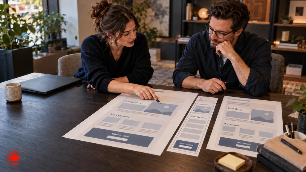
A modular template is a set of ready sections, each designed and tested on its own, that staff stack in whatever order the issue needs. Instead of one fixed layout, you get a small kit of parts that always fit together.
Sections many newsletters need
- Lead story. A large image or none, a headline, two or three lines of summary and one button. This is the section the reader should see first.
- Short items. A compact block for two to four brief updates, each with a headline, a sentence and a text link.
- Events. A date block that shows the day, time and place clearly, with a registration or details link, for workshops, open houses, fundraisers or launches.
- Product or listing cards. Image, name, one detail line and a link, for a retailer’s new arrivals, a brokerage’s listings or a menu’s seasonal dishes.
- Quote or story block. A short member, donor or staff story with a photo, set apart from news.
- Single main button. A full width call to action that closes the issue: book, register, donate, shop or reply.
- Divider and spacer. Plain pieces that keep breathing room consistent so issues never look crowded.
Rules that keep modules from drifting
Each section comes with simple limits written into the guide: how long a headline can run before it should be cut, which image shape the section expects, whether a section may be repeated in one issue, and which sections should never sit next to each other. For example, two image heavy card rows back to back make an issue slow and hard to scan, so the guide suggests a short items block between them. These rules are design decisions, not software settings, and your team can bend them when an issue truly needs it.
One main action per issue
Newsletters with five competing buttons often get fewer taps on any of them. The template gives the lead story and the closing section the only full buttons and uses plain text links everywhere else. If the issue is about a fundraising gala, the gala gets the button. If it is about a spring collection, the collection does. Choosing that action is a small editorial decision each issue, and the template makes the choice visible.
Mobile first layout and readable type
Many people read email on their phones first, and a newsletter that only works on a wide screen fails them. We design the phone version first and let it widen for larger screens, rather than squeezing a desktop layout down.
A single column that stacks cleanly
The core of a mobile first newsletter is a single reading column. Where a section uses two columns on a laptop, such as a pair of product cards, it stacks into one on a phone with the image above its text, never shrunk side by side into thumbnails nobody can read. Readers scroll down naturally; they do not pinch and pan sideways through an email.
Type sizes and line lengths
Body text is set large enough to read without zooming, headlines are clearly larger without shouting, and line length is kept comfortable so the eye does not lose its place on a laptop. Paragraph spacing is generous. Fonts are chosen with fallbacks, because many email apps do not load custom web fonts; your brand font may show in some apps and a close system font in others, and the template is designed to look right in both.
Buttons sized for thumbs
Buttons are tall enough and wide enough to tap with a thumb, with space around them so a reader does not hit the wrong link. Text links inside short items are spaced apart for the same reason. Button labels are written as actions, such as “Register for the open house” rather than “Click here”, which also helps people using screen readers.
Live text, alt text and contrast
A newsletter built as one large image looks polished in the design file and fails in real inboxes. Some email apps and many workplace mailboxes hold back images until the reader allows them, which leaves an image only newsletter as a blank rectangle. Screen readers cannot read words inside a picture, and search inside the inbox cannot find them either.
Live text first
Every headline, paragraph, date and button label in our templates is live text. Images carry photos, product shots and the logo, not sentences. When an event poster arrives from a designer as a single graphic, the guide shows staff how to place the poster as an image and repeat the key details (date, time, place, link) as text right below it.
Alt text that says something useful
Every image slot has room for alt text, and the guide gives examples. A photo of a new storefront might read “Our new Danforth location, open from the first of the month” rather than “image1”. Decorative images, such as a divider flourish, are marked so screen readers skip them. Logo alt text carries the organization name.
Colour contrast
Text and button colours are checked for contrast against their backgrounds so that grey text on a pale panel or white text on a light brand colour does not disappear. Where a brand colour is too light for text, the template uses it for borders or panels and sets text in a darker shade from the same palette.
Dark mode and images that load quickly
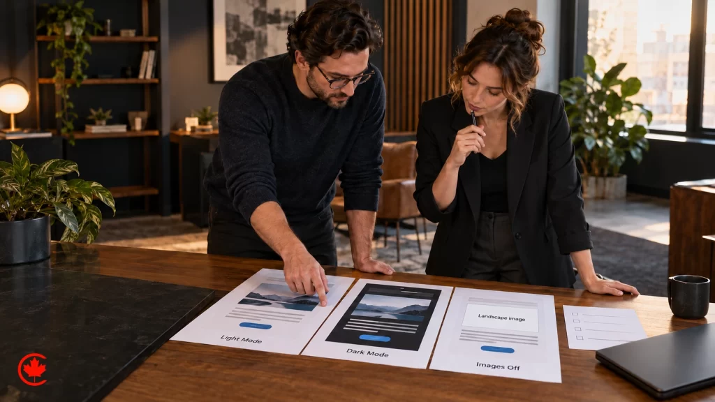
Many readers have dark mode switched on, and email apps handle it in different ways. Some leave the design alone, some flip light backgrounds to dark, and some invert colours only partly. A template designed only for a white background can end up with black text on a dark grey panel or a dark logo that vanishes completely.
Dark mode checks
We check each section in dark mode in the apps that change colours, then adjust. Common fixes include giving a dark logo a light outline or a version for dark backgrounds, avoiding text placed on top of photos, and choosing panel colours that still separate sections after an app darkens them. The goal is a newsletter that reads well in both modes, not one that looks identical in both, because the apps decide part of the outcome.
Image sizes and weight
Large photos make a newsletter slow on mobile data and, in some apps, can push a long issue past the point where the app shortens it behind a “view entire message” link. The guide sets the image shapes each section expects and reminds staff to export photos at sensible sizes before uploading. Animated images are used sparingly, with the first frame carrying the message for apps that show only that frame.
The header, the footer and the plain text version
The top and bottom of the template rarely change between issues, so they deserve the most care. They are also where the details that build trust and meet consent rules live.
Header
The header carries your logo, linked to your website, and optionally a short line such as the issue name or month. It stays slim so the lead story shows on the first phone screen. We also set the preview text, the line many apps show beside the subject, so it adds to the subject instead of repeating “View this email in your browser”.
Footer with sender identification
The footer identifies who sent the email, gives your mailing address and a way to contact you, and includes a clear unsubscribe link that works. It can also hold a link to update preferences, social links and a one line reminder of why the reader is receiving the newsletter, such as “You are receiving this because you joined our member list”. The footer is locked within the template so nobody deletes it by accident while editing an issue.
Plain text version
Every newsletter should have a readable plain text version for apps and readers that prefer it. Many email platforms create one automatically from the designed version, and the result is often messy, with stray image names and long tracking links. We set the template up so the plain text version reads in order: headline, summary, link, next item, with the footer details at the end.
Testing across email apps and phones
Email apps do not display HTML the way web browsers do. Some ignore modern layout code, some strip styles, some add their own spacing. A template that looks right in one app can collapse in another, which is why testing is part of the design, not an afterthought.
What gets tested
- The major phone mail apps and the most common desktop and web mail apps your readers are likely to use.
- Light and dark mode in each app that offers it.
- Images turned off, to see what the newsletter says with live text and alt text alone.
- Every section on its own and in a full sample issue with the longest realistic headline.
- Every link, the unsubscribe link and the preference link.
- The plain text version.
Testing your own audience
If your newsletter goes mostly to workplace addresses, such as a supplier’s trade list or a professional association’s members, we pay extra attention to the desktop apps common in offices. If it goes mostly to households, such as a garden centre’s customer list, phones get the most attention. Your email platform’s reports can usually show which apps your readers open in, and we read that before deciding where to spend testing time.
A template library and a guide for staff
The finished deliverable is not a single email. It is a small library inside your email platform and a one page guide your team can keep open while they build.
What the library holds
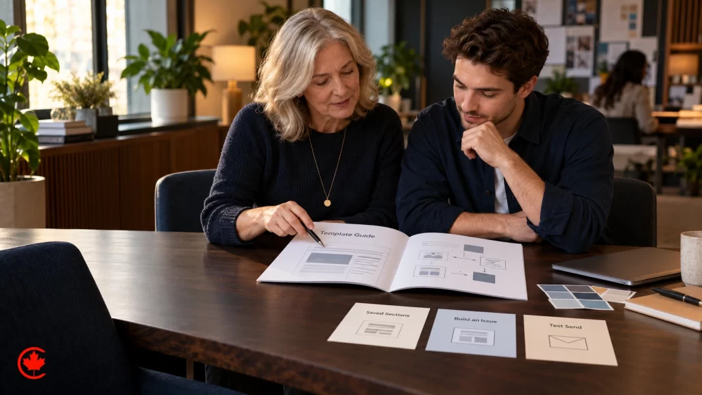
- The master template with every section, locked header and locked footer.
- Two or three ready layouts built from those sections, for example a regular monthly issue, an event announcement and a short urgent update.
- Saved sections that staff drag in, so nobody copies a section from an old issue and carries old links with it.
- Your logo files sized for light and dark backgrounds.
The one page guide
The guide covers image shapes for each section, headline length, how to write alt text, how to choose the one main button, which sections pair well, and the test send routine before every issue. It is written in plain language for someone who did not build the template. If your team writes newsletters in English and French, the guide covers how to keep both versions consistent, and the template is checked with French text, which often runs longer.
A short handover session
We walk your team through building a real issue in the new template, answer questions and adjust anything that turns out to be awkward in practice. After that, the template is yours to use.
How the template fits the rest of your email work
Template design is one piece of the wider email marketing services we offer. The template decides how every issue looks; it does not decide what you send, to whom or when. Planning and running regular sends over the year is covered by our Email campaign management service, and companies that sell to other companies can read about B2B email marketing, which looks at email by role and account.
Brand and visual work
The newsletter should match the rest of your brand. If you already have a style guide, the template follows it; if not, the newsletter is often the moment to write down your colours, fonts and button rules, and our brand guidelines work can cover the full set. Photos and graphics for regular issues can come from our graphic design team, and the template links back to pages on a site built by our website design service so the reader lands somewhere that looks the same.
Specialized newsletters
Some newsletters have their own needs. Real estate agents who send listing updates and market notes can see our real estate newsletter service, and online stores that send product emails from their store platform can look at Shopify email marketing. Contacts who join from a website form can be kept in order in CS+, our CRM, which we set up and connect through our CRM setup service. Automated welcome series are a separate topic we scope on request.
Consent, privacy and accessibility rules
A newsletter template is where several rules show up on the page, so the design should make following them the default rather than something staff remember each time.
- CASL. Canada’s anti spam law applies to commercial email, and many newsletters count as commercial because they promote products, services or events. In general, you need express or implied consent to send, each email must identify the sender with contact details and a mailing address, and it must carry a working unsubscribe that is honoured promptly. A locked footer keeps those items in every issue.
- PIPEDA. Personal information such as names and email addresses is covered in general terms by federal privacy law. Collect only what you need for the newsletter, say how you will use it and keep the list secure.
- Accessibility. Live text, alt text, clear contrast, readable sizes and descriptive button labels follow the spirit of WCAG and make the newsletter usable for people with screen readers or low vision. Ontario organizations may also have AODA obligations for their communications.
- Quebec. If you send to readers in Quebec, French language and Quebec privacy rules may apply, and a bilingual template should be planned from the start.
This is a marketing observation, not legal advice. If your organization has specific legal questions about consent or privacy, speak with your own lawyer before you send.
How we design your newsletter template
Every project starts with a free review of your last few issues, your brand files and the email platform you use. We look at how a recent issue renders on a phone and in dark mode, how long it takes your team to build one, and which sections you repeat every time.
- Free review. A conversation with whoever builds the newsletter today and a look at recent issues and your platform.
- Written proposal. The sections, layouts, languages and testing in scope, with fees quoted in writing.
- Design. A mobile and desktop design of the master template and sections, using your real content, for your approval.
- Build and test. The template built inside your own email platform, then tested across apps, phones, dark mode and images off.
- Library and handover. Saved sections, sample layouts, the one page guide and a session with your team.
The template lives in your email platform account, under your login, and every design file is yours. If you later want help building issues each month, that can be added; if your team builds them, you have everything you need.
What newsletter template design costs
Newsletter template design is quoted in writing after the free review. The fee depends on how much needs to be designed and how many places it has to work.
What drives the quote
- How many sections the library needs, from a simple news and button set to product cards, events and story blocks.
- How many ready layouts you want, such as monthly issue, event invitation and urgent update.
- Whether the newsletter is in one language or both English and French.
- Whether your brand rules already exist or need to be set for email first.
- How many email apps and devices your audience uses that need focused testing.
- Whether you need photos, illustrations or icons created for the template.
- Whether ongoing help building each issue is part of the work.
Your email platform subscription is paid to the platform and shown separately from our fees. We design within the plan you have; if a feature you want needs a higher plan, we tell you before you decide.
How to choose a newsletter designer
A pretty mock up is easy to make. A template that survives dark mode, images off and a staff member in a hurry takes more care. Before you hire, ask:
- Will the template be built inside our own email platform, or delivered as a file we have to import and fix?
- Is the text live, or are sections built as images?
- Which email apps and phones will you test in, and will you show us the results?
- How does the template handle dark mode and images turned off?
- Will our staff be able to reorder sections without breaking the layout?
- What does the footer include, and is it locked?
- Who owns the accounts? The answer should be you, along with the template, the design files and the logo exports.
- Will we get a guide written for the person who builds each issue?
Clear answers to these questions tell you whether you are buying a picture of a newsletter or a working tool. You can learn more about our team on the about Canada Create page.
Book an email newsletter design consultation in Toronto
Start with a free newsletter review. Forward us your last two or three issues and tell us which email platform you use, and we will show you how they look on a phone, in dark mode and with images off, and what a modular template would change for the person who builds them. Call (416) 273-9030, Monday to Friday, 9 am to 6 pm, and Saturday, 10 am to 2 pm. After hours, our 24/7 AI agent answers the toll-free line, +1 (800) 808-9235, and we’ll follow up the next business morning. You can also reach us through our contact page. We reply within one business day. Our office is at 126 Willowdale Avenue, Suite 3, Toronto, and we design newsletter templates for organizations across Canada.
Talk to a strategist
Ready when you are?
Request a custom proposal
Tell us your goals, budget and timeline. You get a custom proposal and a named strategist, so your next stage of growth starts now.
Four stages of email newsletter design, from brief to handover
Each step is written down, and the template lives in your own email platform account.
- Free review First call
Your recent issues, brand files and email platform.
- Written proposal Written proposal
Sections, layouts, languages, testing and fees quoted in writing.
- Design, build and test Agreed milestones
Designs for approval, then the build in your platform and testing across apps.
- Handover Agreed milestones
Section library, sample layouts, the staff guide and a working session.
Why newsletter senders choose Canada Create
Since 2008
More than 18 years of websites, search and advertising work for businesses across Canada.
BBB Accredited A+
A BBB Accredited Business with an A+ rating and zero complaints.
Toronto office
126 Willowdale Avenue, Suite 3, Toronto, serving businesses across Canada.
English and French
Our team works in English and French.
Email newsletter design questions
How do you design a good email newsletter template?
Design it for two people: the reader who skims for a few seconds and the staff member who builds each issue on a busy Thursday. The reader needs a clear sender name, one obvious lead story, short items below it and a single main button. The builder needs tested sections that can be reordered without breaking and a short guide that says what each section expects.
Are email newsletters still worth designing well in 2026?
A newsletter only works if it reads properly where people open it, and many readers now see email first on a phone, often with dark mode on. A template that falls apart on a phone, loses its logo in dark mode or takes an afternoon to rebuild each time costs more than the design work. A tested template turns the layout into a fixed frame so only the content changes from issue to issue.
What sections should an email newsletter include?
Most newsletters draw on a small kit: a lead story with a headline, short summary and one button, a short items block for brief updates, an events block with date, time and place, product or listing cards, a quote or story block and a full width closing button. Dividers and spacers keep the breathing room consistent. Staff stack these in whatever order each issue needs.
What size should an email newsletter design be for phones?
Design the phone version first around a single reading column, then let it widen on larger screens. Two column sections, such as paired product cards, stack into one column on a phone with the image above the text. Body text should read without zooming, and buttons need to be big enough for a thumb with space around them.
What does email newsletter design cost?
Price depends on the scope: a starter template for a simple monthly issue, a full modular library for teams sending several kinds of email, a bilingual English and French template, or a refresh of a template that breaks. The number of sections, sample layouts and testing rounds also matter. Your email platform subscription stays a separate cost you pay the platform. After we look at a recent issue for free, the template fee goes into a written quote.
What are the email newsletter design best practices for accessibility and dark mode?
Keep every headline, date and button label as live text, since many workplace mailboxes hold back images and screen readers cannot read words inside a picture. Give each image useful alt text, check colour contrast for text and buttons and use a too light brand colour for borders instead of text. Check every section in dark mode, adjusting the logo and panel colours so nothing disappears.
Is a free email newsletter design template good enough?
A generic starter template can get a first issue out, but many organizations end up with a newsletter that looks nothing like their website, signage or brochure years later. A designed template sets the logo, palette, fonts, buttons and footer once, so an issue written by a new hire still looks like your organization. It is built inside the email platform you already pay for.
How many buttons should an email newsletter have?
Usually one main action per issue. Newsletters with five competing buttons often get fewer taps on any of them, so the template gives full buttons only to the lead story and the closing section and uses plain text links elsewhere. Button labels should name the action, such as register for the open house, which also helps screen reader users.
What must the footer of an email newsletter include in Canada?
Under CASL, commercial email has to identify who sent it, give a mailing address and offer an unsubscribe that works, so a newsletter footer carries those in every issue along with a preference link. Locking the footer in the template means no one can delete it by accident. Check the current CASL rules with the CRTC when your consent practices change.
How do I choose a professional email newsletter designer in Toronto?
Ask whether the template will be built inside your own email platform, how it is tested across email apps, phones and dark mode, and whether staff get a section library and a one page guide. Bilingual organizations should ask about paired English and French layouts. Canada Create builds newsletter templates from its Toronto office for clients across Canada; the people building bilingual newsletters work in both French and English.

Stop rebuilding every issue
A newsletter that breaks on phones or takes an afternoon to assemble wastes the time of the person who sends it. A tested, modular template fixes the frame once so each issue is about the content. Book a free newsletter review.