Browsing polished website designs often sparks creative excitement. However, transforming visual admiration into a functioning website requires structured evaluation. Instead of trying to mimic surface aesthetics, you can examine real-world builds to define exact functional requirements, layout patterns, and administrative workflows before choosing or building your next WordPress theme.
The Difference Between Inspiration and Off-the-Shelf Demos
When you browse official collections like the WordPress Showcase, you will see high-profile entries such as The New York Times Company corporate website, NASA, The Atavist Magazine, and the restaurant Noma. These platforms demonstrate the flexibility of the software at scale. However, it is essential to distinguish between bespoke corporate builds and downloadable pre-made themes. Many enterprise examples run on proprietary architectures, custom page templates, and dedicated engineering stacks. Conversely, commercial demos found on marketplaces or the WordPress Theme Directory rely on curated filler content, tailored stock photography, and specific bundled plugins to look striking. Recognizing this gap prevents unrealistic expectations during initial planning.
Selecting Three Relevant Reference Sites
To build an actionable design brief, select three distinct reference websites based on architectural alignment rather than sheer visual appeal. Choose projects that mirror your primary user journeys, expected content density, and core operational needs. For example, if you manage an editorial site, look at high-density publications rather than minimalist single-page portfolios. If you sell specialized consulting services, focus on corporate sites that guide visitors through multi-tiered service offerings. Gathering references with matching goals ensures you analyze applicable information structures. While browsing editorial layouts, you might review specialized breakdowns like our guide to choosing a WordPress magazine theme to observe how high-volume publications handle complex category hierarchies and archive displays effectively.
Analyzing Layout Structures and Content Density
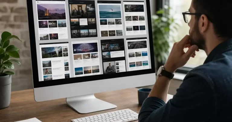
Dedicate your first reference site review exclusively to layout structure and content volume. Examine how the homepage and interior landing pages organize multiple tiers of information without overwhelming the reader. Pay attention to column splits, whitespace distribution, and how grid systems shift as users scroll downward. Note how many headlines appear above the initial screen fold and how primary headlines differ from secondary teasers. Measure how editorial excerpts are cropped and whether metadata, such as publication dates or author names, clutters the visual hierarchy. Documenting these spatial decisions reveals how much physical space your own text and multimedia will demand, helping you avoid templates that cramp your primary messaging.
Deconstructing Navigation Patterns and User Paths
Use your second reference site to evaluate navigational architecture and user flows. Click through the primary menu, utility links, search bars, and footer sitemaps to trace common visitor paths. Notice how the site handles nested subcategories and whether mega-menus provide genuine clarity or unnecessary friction. Observe the mobile experience closely: does the responsive menu open cleanly, maintain readable touch targets, and preserve access to key conversion points? Track the number of interactions required to move from the homepage to an actionable page, such as a contact form or service detail. A strong theme brief specifies these navigational boundaries so designers prioritize intuitive browsing over decorative novelty.
Assessing Media Treatment and Art Direction
Focus your third site review on imagery, typography, and media treatments. Look at how photographic assets are cropped across different screen sizes and whether vertical or horizontal orientations dominate the layout. Notice the relationship between photography and background styling: are images displayed with subtle borders, flat backgrounds, or dynamic overlays? Look at typographic hierarchy, noting how header font sizes scale down on mobile screens to preserve legibility. Most importantly, remember that demo assets and brand photography carry legal copyrights and tailored production values you cannot simply copy. Your brief must specify media formats that match your team’s realistic ongoing production capabilities.
Stress-Testing Layouts with Real-World Content
A major pitfall in website design is relying on idealized sample content. Dummy placeholder text rarely reflects the messy realities of active publishing. In your theme brief, require that all proposed templates undergo testing with actual draft content. Create scenarios with unusually long headlines, foreign language characters, missing featured images, and irregular paragraph lengths. Test how menus react when page titles wrap onto two lines, or how tables render on small smartphone screens. Ensure the proposed design supports full keyboard accessibility and visible focus states for standard navigation. Stress-testing templates prevents layouts from breaking the moment real contributors publish unformatted text or omit optional visual assets.
Documenting Administrative Tasks and Plugin Overhead
A complete theme brief addresses back-end administration alongside front-end presentation. Consider the day-to-day administrative experience required to maintain dynamic sections, banners, and sidebar widgets. Ask whether creating a new case study or landing page requires complex block nesting or straightforward standard fields. Outline necessary functional integrations, such as search engine optimization tools, forms, custom post types, and analytics scripts. Highlighting these administrative requirements helps avoid complex themes that demand dozens of heavy, third-party plugins to replicate standard layouts. Specifying a streamlined editorial workflow early ensures your internal team can update content efficiently without needing ongoing developer assistance for routine formatting changes.
Synthesizing Observations into a Working Design Brief
Conclude your research process by assembling your findings into a single, concrete theme brief document. Structure the brief around verified layout requirements, detailed navigation rules, realistic asset dimensions, and editorial constraints. Explicitly list anti-patterns discovered during your reviews—elements you deliberately choose to exclude, such as distracting banner carousels or low-contrast body text. Provide clear guidelines on performance thresholds, requiring minimal asset bloat and fast mobile rendering. By translating observed examples into concrete specifications, you hand designers and developers a functional roadmap. This systematic method transforms subjective aesthetic admiration into an objective blueprint built to support your organization’s unique content strategy and digital communication goals.
For example, turn “I like this homepage” into “Editors need to feature one lead story, four recent updates and a clearly labelled archive link without editing code.” That requirement can be demonstrated with your own content. It remains useful even if the final colours, images and typefaces differ completely from the reference.
Frequently Asked Questions
How do I use website examples to plan a new site?
Note what each example does for its visitors, then turn those observations into a written brief.
Should I copy a competitor’s website?
No. Use examples for inspiration, then design around your own services and customers.
What should a website brief include?
Goals, audience, pages, features, content, brand and budget.
Who can turn my brief into a website?
Our website design team.