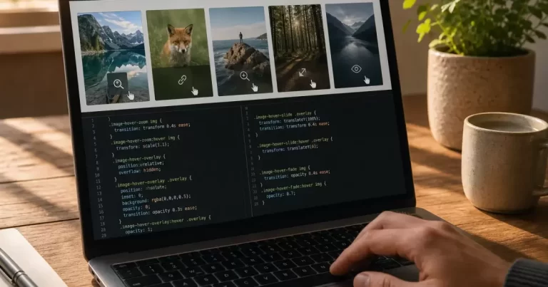
An image card can work beautifully with a mouse and become confusing on a phone. The first tap might reveal a caption while the second follows a link. A keyboard user may never reach the hidden button. A flipbox may show an empty panel because its image failed to load, even though the animation itself still runs.
Fix these problems by separating the content, image delivery and interaction. The card should remain useful without its decorative effect. This guide is for troubleshooting existing cards and flipboxes. For an overview of implementation options, see our WordPress image hover-effects guide.
Define the card’s essential job
Write down what visitors must learn or do. A portfolio tile might need a project name and a link. A product card might need its name, price and purchase route. Those essentials should not depend on discovering an invisible hover state. Motion can provide emphasis, but it should not be the only way to access important information.
Compare the normal, hovered, focused and touched states. Record which text and controls exist in each. If the normal state is just a photograph with no obvious purpose, improve that foundation before tuning animation speed. A visible title and clear action often remove the need for a complicated reveal.
Distinguish a missing image from a hidden image
If a flipbox appears blank, inspect the image request in the browser’s network tools. Open the image URL directly and check whether it loads. A missing file, blocked request or incorrect URL requires a media-delivery fix. Changing transition settings will not repair a resource that the browser cannot retrieve.
If the image loads successfully, inspect its rendered size and visibility. A container with no effective height, an opaque overlay or a stacking rule can conceal a valid image. Compare the front and back faces of the card. Make one change at a time on a staging copy and keep the original values available for rollback.
Check the saved media selection in the actual plugin or builder that owns the card. The editor preview may use a different image size or cached output from the public page. Verify the public URL while signed out after clearing the relevant cache. Avoid deleting and re-uploading the asset until the evidence points to the file itself.
Design touch behaviour deliberately
Touch screens do not provide the same interaction as a mouse pointer. Some devices emulate hover in particular circumstances, but that is not a dependable way to reveal essential controls. Test the actual card on a phone: tap once, tap again, scroll past it and return. Note whether the card stays in an unexpected state.
MDN’s hover media-feature documentation explains how CSS can respond to whether the primary input can conveniently hover. Use that capability as an enhancement condition rather than treating screen width as proof of input type. A large screen can still be touch-operated, and a small device may have an attached pointer.
A straightforward touch layout keeps the caption and action visible beneath the image. If a disclosure is genuinely needed, give it an explicit control with an understandable state. Avoid making the same tap ambiguously mean both “reveal information” and “navigate away.” Ask someone unfamiliar with the card to use it without instructions.
Follow the keyboard path
Move through the page using the keyboard. Confirm that each interactive card has an appropriate link or button, a visible focus indicator and a predictable activation action. Do not add keyboard focus to every decorative image. Focus should lead to something the visitor can use or meaningfully interact with.
When additional content appears on hover or focus, review the W3C guidance on that content. It describes when the content must be dismissible, hoverable and persistent, including relevant exceptions. A tooltip that vanishes as the pointer moves toward it is a common example of an interaction that needs attention.
Test whether a revealed button remains reachable and whether closing the overlay preserves a sensible focus location. If the effect depends on a plugin, verify these behaviours in the installed version rather than assuming that a “responsive” label includes keyboard accessibility. Record any limitation before selecting a replacement component.
Respect reduced-motion preferences
Large zooms, flips and moving backgrounds can be uncomfortable for some visitors. Check the page with the device’s reduced-motion preference enabled. MDN documents the prefers-reduced-motion media feature, which allows a design to respond to that preference. The reduced-motion version should retain the information and action.
Keep decorative changes restrained and avoid combining several movements in one card. Removing an animation is often easier to understand than replacing it with another elaborate effect. Check the result in the public page after the preference changes. A setting in your operating system does not automatically mean every plugin respects it.
Check collisions before adding another plugin
A theme, page builder and hover extension may all apply effects to the same image. Inspect the component’s classes and loaded assets to identify ownership. On staging, isolate one layer at a time and repeat the failing interaction. Keep notes so you can restore the baseline and distinguish a real fix from an unrelated change.
Also check whether nearby content shifts when the effect begins, whether the overlay covers another link and whether the action remains usable at increased text size. Small decorative changes can have consequences beyond the card’s border. Test a row of several cards, not only a single isolated example.
Finish with four interaction checks
Verify the saved card with a mouse, keyboard, touch input and reduced motion. In each case, the image should load, essential information should remain available and the action should be understandable. Preserve screenshots or brief notes of any remaining exceptions. A successful fix makes the card useful before the animation starts and dependable after it ends.
Frequently Asked Questions
Why don’t CSS hover effects work on mobile?
Touch screens have no hover state, so effects may never show or may need a double tap.
How do I make hover effects mobile-friendly?
Show key content by default, and use @media (hover: hover) to apply hover-only styling on devices that support it.
Do hover effects hurt accessibility?
They can if important information appears only on hover. Make it available on focus and tap too.
Who can fix mobile design issues on WordPress?
Our website design team fixes mobile interactions.