A new hero photograph can look perfect in the WordPress editor and wrong on the live website. Faces disappear at narrow widths, a heading lands over a busy background, or the first screen takes longer to appear. Replacing the file is only one part of the job. You also need to preserve the section’s layout, message and loading behaviour.
This guide is for changing an existing hero, especially when the current design works and you want to keep it. If you are creating the section from scratch, start with our guide to adding a WordPress hero image. Before editing, save the current image and record the section settings so you have a clear rollback.
Find what actually controls the image
Start on the exact page you want to change. The large photograph may belong to a Cover block, a page-builder container, a theme setting or a shared template. A post’s featured image is a separate field unless the design deliberately uses it as the hero. Changing that field will not necessarily change the banner.
Open the relevant editor and select the image’s surrounding section. Check whether the image is assigned directly or pulled dynamically from another field. Also check whether the section is shared. Replacing an image in a global header could affect several pages, while editing a local block should have a narrower effect. If the source is unclear, identify it before saving.
Choose the photograph for the crop
A hero usually occupies a wide rectangle on a desktop and a narrower area on a phone. A photograph that needs its entire width to make sense is difficult to fit into both. Choose an image with one clear subject and enough surrounding space to tolerate cropping. Keep important details away from the outer edges.
There is no single pixel size that suits every theme. Look at the section’s displayed width and height, then prepare a source with enough detail for the intended screens. Avoid enlarging a small photograph to fill a large banner. Conversely, uploading an enormous camera original can increase transfer size without improving what visitors actually see.
Prepare a separate export instead of overwriting your only original. Give it a useful filename, retain its permitted-use information and compare the result at normal viewing size. Fine detail, gradients and faces are worth checking after compression. File format alone does not prove that an image is small enough or visually acceptable.
Replace the file while preserving the section
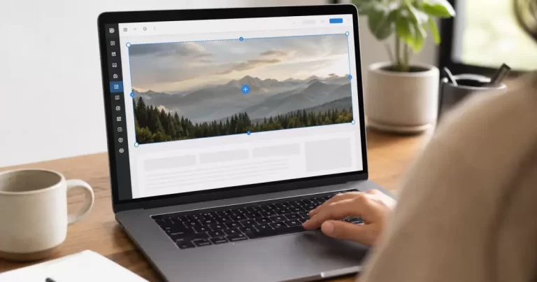
For a standard Cover block, select the block and use its Replace control to choose the new media. WordPress’s Cover block documentation explains the replacement, resolution and focal-point controls. Their availability depends on your WordPress version and the block configuration. Page builders and classic themes use their own controls.
Change the image first and leave the other settings alone. This makes it easier to see whether a problem comes from the new photograph or an unrelated layout change. Keep a note of minimum height, spacing, alignment and overlay settings before adjusting any of them. Preview the saved result rather than relying solely on the editor canvas.
Fix the focal point before changing dimensions
If the subject disappears on mobile, first adjust which part of the photograph stays visible. In a Cover block, the focal-point picker is available when fixed background is off. Move the point toward the subject and preview several widths. A small change can keep a face or product visible without increasing the section height.
If one crop cannot work everywhere, use a design that places the image beside the text or provides an appropriate mobile-specific asset where your editor supports it. Avoid duplicating an entire hero simply to change a photograph unless you understand the accessibility and loading consequences. Hidden sections can still add unnecessary content or downloads.
Keep the message readable
Read the heading over the brightest and darkest parts of the new image. An overlay that worked on the previous photograph may no longer provide sufficient contrast. Adjust the overlay or move the text to a calmer area. Do not solve a busy background by shrinking the heading until it becomes difficult to read.
Keep essential copy as real text rather than embedding it inside the photograph. That makes it easier to resize, translate and update. If the image communicates information that the text does not provide, write an accurate alternative description. If it is purely decorative, use the appropriate decorative treatment for the actual markup. Do not fill alternative text with search keywords.
Check loading, not just file size
A hero can become the page’s Largest Contentful Paint element, but you should measure rather than assume. In a performance report, identify the element and inspect when its image request begins. A modest file can still appear late if it is discovered only after additional styling or scripts have loaded.
Google’s LCP guidance advises against lazy-loading the LCP image and explains how discovery and priority affect loading. Inspect the rendered output before changing optimization settings. WordPress, the theme or a performance plugin may already handle image priority. Adding several competing rules can make the behaviour harder to diagnose.
Use a repeatable release check
Compare the before-and-after version using the same page, screen widths and connection conditions. Check the actual public URL while signed out. If an older version appears, clear only the relevant cache and verify again. Do not repeatedly replace files while looking at stale output.
- Confirm the correct photograph appears on desktop and mobile.
- Check the subject, heading and button at narrow widths and increased text size.
- Follow the button to verify its destination still works.
- Confirm the image loads successfully and compare performance measurements.
- Keep the previous asset until you know it is unused elsewhere.
The replacement is finished when the new photograph supports the same clear message across devices and the public page behaves as expected. Record the image, date and settings you changed. That small handover note makes the next seasonal update much easier.
Frequently Asked Questions
What size should a WordPress hero image be?
Around 1920 pixels wide for full-width desktop heroes, compressed as WebP, with a smaller version for mobile.
Why is my hero image cropped on mobile?
Background images scale to fill the screen, so the sides are cut off. Set a focal point or use a mobile-specific image.
Does a large hero image hurt SEO?
A heavy hero can slow Largest Contentful Paint. Compress it and avoid lazy-loading the hero.
Who can optimize hero images and layouts?
Our website design team handles responsive image setup.