

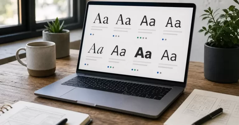
19 Best Web Safe Fonts for Your Site
Last updated: July 2026
Quick Answer
If you need a font that displays the same way on every browser without any load time, stick to system defaults like Arial, Helvetica, Georgia, Verdana, Times New Roman, and Courier New. These make up the backbone of any solid web safe font list and work as reliable fallbacks even if you layer a custom web font on top, a principle Canada Create applies across every client build.
A web safe font is simply a typeface that ships with the operating system rather than being downloaded from a server. Because there’s no external request, the text on your homepage or a client’s landing page shows up instantly, which matters for both user experience and Core Web Vitals scores. At Canada Create, we test font rendering across devices for every project, and this list reflects what actually performs well in practice.
Why Web Safe Fonts Still Matter in 2026
Custom web fonts from services like Google Fonts have made typography more flexible, but they still require a network request that can delay text rendering, sometimes causing a flash of invisible text. A well-built css font stack guide uses a custom font as the primary choice and a web safe font as the fallback, so visitors never see a blank paragraph while the browser fetches your preferred typeface.
For Toronto small businesses running on tight hosting budgets, this fallback approach also protects page speed when a font CDN has a slow moment. Canada Create readers often ask whether skipping custom fonts entirely is safer. It usually isn’t necessary. It’s about pairing choices correctly, which is what the rest of this guide walks through.
The Full Web Safe Font List: 19 Reliable Choices
Sans-Serif Fonts
- Arial: The most universally available sans-serif, clean and neutral for body text.
- Helvetica: Apple’s default sans-serif, nearly identical to Arial on non-Apple systems.
- Verdana: Wider letter spacing designed for screen legibility at small sizes.
- Tahoma: Compact and readable, common in UI elements and navigation menus.
- Trebuchet MS: A friendlier, more humanist sans-serif with rounded terminals.
- Segoe UI: Microsoft’s system font, standard on most Windows machines.
- Calibri: Softer geometric shapes, common in Office documents and Windows 11.
- Century Gothic: Geometric and airy, good for headlines but weaker for dense paragraphs.
Serif Fonts
- Times New Roman: The classic print-style serif, still widely supported.
- Georgia: Designed specifically for screen readability, larger x-height than Times.
- Cambria: A modern serif built for both print and digital clarity.
- Garamond: An elegant, older-style serif, best for larger body text sizes.
- Palatino: A humanist serif with calligraphic touches, good for editorial content.
Monospace Fonts
- Courier New: The standard typewriter-style monospace font.
- Lucida Console: A cleaner monospace option common in code blocks.
- Consolas: Microsoft’s modern coding font, easier on the eyes for long snippets.
Cursive and Fantasy Fonts
- Brush Script MT: A handwriting-style cursive font, best used sparingly for accents.
- Comic Sans MS: Casual and playful, divisive but still technically web safe.
Pro tip: Even the best web safe fonts look different across operating systems. Always test your chosen stack on both Windows and macOS before finalizing a design, something we build into every website redesign checklist at Canada Create.
How to Use Web Safe Fonts Correctly in CSS
A proper CSS font stack lists several fonts in order of preference, separated by commas, so the browser falls back gracefully if the first choice isn’t available. Canada Create builds this fallback logic into every theme file by default.
| Font Category | Sample CSS Font Stack |
|---|---|
| Sans-serif | font-family: Helvetica, Arial, "Segoe UI", sans-serif; |
| Serif | font-family: Georgia, Cambria, "Times New Roman", serif; |
| Monospace | font-family: Consolas, "Lucida Console", "Courier New", monospace; |
Notice the generic family name (sans-serif, serif, monospace) at the end of each stack. This is the safety net: if none of the named fonts are installed, the browser still picks something in the right visual category rather than defaulting to something jarring. The MDN font-family reference documents every generic family keyword supported across modern browsers.
Step-by-Step: Building a Font Stack
- Pick a primary custom font (optional) from a source like Google Fonts if brand identity calls for it.
- Choose two or three fonts that display on every browser as fallbacks in the same visual style.
- End the stack with the correct generic family name.
- Test rendering on Windows, macOS, iOS, and Android before shipping.
Google Fonts Alternatives and When to Use Them
Google Fonts alternatives are worth considering when a project needs guaranteed fast load times, such as a low-bandwidth region or a performance-sensitive landing page. In those cases, sticking entirely to a web safe font list avoids the render-blocking request altogether. [IMAGE: side-by-side comparison of a custom Google Font versus a web safe fallback rendering, related to best web safe fonts]
For most Toronto small business sites we work on through our downtown Toronto web design services, a hybrid approach works best: one custom font for headlines loaded with font-display: swap, and a solid web safe fallback for everything else. This keeps brand personality intact without sacrificing speed. Google’s own Fonts Knowledge guide covers pairing and licensing basics if you decide to add a custom typeface later.
Common Mistakes to Avoid
- Forgetting the generic family name at the end of the stack.
- Mixing fonts with very different x-heights, which makes fallback text look mismatched.
- Using more than two font families on a single page, which slows rendering and hurts consistency.
- Ignoring mobile rendering, where some desktop-only fonts don’t exist at all.
As we cover at Canada Create, font choice is one of the smallest decisions in a build that has an outsized effect on how professional a site feels. It pairs closely with broader decisions like the ones covered in our guide on what goes into a website design quote.
Serif vs Sans-Serif: Which Should You Choose?
Sans-serif fonts like Arial and Helvetica tend to read cleaner on screens, especially at smaller sizes, which is why most navigation menus, buttons, and body text on modern sites default to them. Serif fonts like Georgia and Cambria carry a more editorial, trustworthy feel and often work well for headlines, pull quotes, or long-form articles where readers are settling in for a few minutes.
Neither category is objectively better. The right choice depends on brand tone and the density of text on the page. A law firm site might lean serif for gravitas, while a SaaS product page usually leans sans-serif for a modern, approachable feel. This is a decision we walk clients through directly, similar to how we approach lawyer website design in Toronto versus a fast-moving startup brand.
Frequently Asked Questions
What exactly is a web safe font?
A web safe font is a typeface pre-installed on the vast majority of operating systems and devices, meaning the browser doesn’t need to download anything to display it correctly.
Are web safe fonts still relevant now that Google Fonts is free?
Yes. Google Fonts and other custom font services still require a network request. Web safe fonts remain essential as fallback options in any properly built css font stack guide, and sometimes as the primary choice for performance-critical pages.
What is the most universally supported web safe font?
Arial is generally considered the single most reliably available sans-serif font across Windows, macOS, and most Linux distributions.
Can I combine a Google Font with a web safe fallback?
Yes, this is standard practice. List your Google Font first in the CSS stack, then add two or three web safe fonts of a similar style as fallbacks, ending with the generic family name.
Do web safe fonts affect SEO?
Indirectly, yes. Fonts that load instantly improve Core Web Vitals metrics like Largest Contentful Paint, which Google factors into page experience signals. Canada Create readers building performance-focused sites should treat font strategy as part of technical SEO, not just design.