
The most successful websites not only have an appealing design but also effectively guide visitors towards taking action.
Whether it’s signing up for a newsletter, making a purchase, or reaching out for more information, effective design simplifies the process for visitors.
Success in web design relies more on strategic, goal-oriented decisions than on large budgets or extravagant features.
Having collaborated with numerous WordPress sites across various industries, we’ve identified the elements that truly drive results.
The highest-performing websites share several key design features, and the great news is that any website owner can implement them.
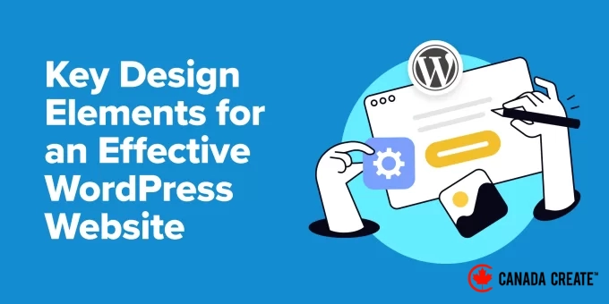
In this guide, we will explore these crucial design elements to help you build a website that not only appears professional but also contributes to your business growth.
First Steps: Selecting the Right Tool for Designing Your WordPress Site
Before diving into the best design elements for WordPress websites, it’s important to discuss the right tools for editing your site.
We have experimented with various website-building methods, from user-friendly drag-and-drop builders to hand coding for custom features. Each approach has its advantages based on your specific needs.
That said, we believe the ideal WordPress website design tool is one that:
- Aligns with your skill level and your design objectives.For beginners, drag-and-drop page builders are user-friendly and require no coding skills. However, if you are proficient in coding, you may prefer the flexibility and control that coding offers.
- Includes all the necessary features for your website.Certain theme builders, such as SeedProd, offer unique blocks like testimonials and countdown timers that can effectively convert visitors into customers. Others may only provide basic design components. Consider the specific needs of your site for optimal performance.
- Integrates seamlessly with other software you use.Whether you’re using tools for email marketing or design applications like Figma, everything should work together seamlessly. This integration simplifies the process of enhancing your WordPress website with appealing design elements.
- Fits within your budget.Avoid overspending on tools with features you won’t utilize. Seek options that provide the best value for your investment.
We have published numerous reviews and lists for various web design tools, including AI website builders, but SeedProd remains our top recommendation.
As a theme builder, SeedProd is user-friendly yet packed with features. You can easily drag and drop elements to your desired locations, and it offers more blocks and design elements than the standard WordPress options.
SeedProd offers an impressive AI feature that can create an entire website for you. Simply specify your requirements, and within a minute, your new site is ready.
Discover more details in our comprehensive SeedProd review.
If SeedProd isn’t your preferred option, we recommend Thrive Architect as an alternative page builder. While it is slightly more advanced, it seamlessly integrates with numerous conversion rate optimization tools, including Thrive Ultimatum.
Another tool we recommend is CSS Hero. It’s perfect for users of classic WordPress themes who want to customize their appearance without coding or require more flexibility than what the theme developer provides.
Learn more about CSS Hero in our detailed review.
Alternatively, you can utilize the built-in WordPress features like the full-site editor. This allows you to personalize your theme using blocks, similar to composing a post or page. However, you may need additional Gutenberg block plugins for more advanced design capabilities.
Once you’ve selected the right tool, you’re set to create a visually appealing and user-friendly WordPress website. Below are the topics we will discuss, along with quick links to navigate through this article:
- Essential WordPress Web Design Elements
- Mobile-Friendly WordPress Theme
- Brand-Reflective Color Palette
- Easy-to-Read Typography
- Compelling Website Header
- User-Friendly Navigation Menu
- Detailed Footer Area
- Striking Above-the-Fold Section
- User-Friendly Contact Form
- Website Accessibility Features
- Key Design Elements for WordPress Blogs
- Useful Sidebar Widgets
- Content Suggestion Sections
- Readability Enhancements
- Appropriate Featured Images
- Clear and Engaging Visuals
- WordPress Design Features to Boost Conversions
- Coming Soon Landing Page with Waitlist
- Attention-Grabbing Call-to-Action Button
- Easy-to-Understand Feature Boxes
- Elements Showcasing Social Proof
- Eye-Catching Promotional Banners
- High-Converting Shopping Cart and Checkout Pages
- Additional WordPress Design Features to Delight Visitors
- Commonly Asked Questions
Essential WordPress Web Design Features
Through our extensive experience with WordPress websites, we have discovered that design requirements can vary significantly.
However, there are some key elements that every site should have, regardless of its niche or purpose. These essential components form the backbone of effective WordPress website design and contribute to a great user experience.
In this section, we will explore these must-have design elements for your WordPress site. We’ll discuss various plugins and themes that can help you implement these features.
Keep in mind that not all tools may suit your specific needs. If you want to test them without risk, try using WordPress Playground. It lets you experiment with different design elements without affecting your live site.
1. Responsive WordPress Theme
The foundation of any great WordPress website design is a functional, good-looking, and mobile-friendly theme.
Without it, your site may struggle to provide a consistent user experience across different devices, which is very harmful in today’s mobile-first world.
After testing out different WordPress themes for years, we’ve developed a set of criteria on how to choose the best WordPress theme for your website.
First, ensure the theme is responsive. It should look good and function well on all screen sizes. Check out our guide on how to view the mobile version of WordPress sites from desktop to test the theme.
Next, verify that the theme includes all the necessary features you require. Some themes offer layouts with sidebars, while others may include animated effects or even come bundled with additional plugins for enhanced functionality.
Additionally, select a theme that you can utilize for the long term. Switching WordPress themes can be complicated and often necessitates rebuilding certain parts of your site. Ensure that the features and design elements align with your long-term goals.
Moreover, check for compatibility with popular plugins and page builders that you intend to use. For instance, if you plan to implement WooCommerce for your online store, confirm that the theme is compatible with it.
In addition, make sure to test your WordPress theme against the latest standards. This step is crucial to ensure that your theme adheres to WordPress guidelines and modern web standards, which can help avoid security vulnerabilities and compatibility problems.
You should also assess the theme’s performance. If possible, test the demo site for speed. Some themes may contain unnecessary bloat that can slow down your website.
Lastly, ensure that the theme comes with comprehensive documentation and support. Check the date of the last update for the WordPress theme, as this information can be vital when you need assistance.
Enable auto-updates to ensure your theme stays up-to-date with the latest features and security enhancements. However, if your site has a complex setup, we advise against this, as some updates may cause issues.
Lastly, keep your budget in mind. While premium WordPress themes are typically of high quality, this isn’t always guaranteed. Be cautious when downloading free themes and refer to our guide on free versus premium WordPress themes to make an informed choice.
For our website, we are selective about our theme, which is why we opted to develop a custom WordPress theme based on the Genesis framework. This approach gives us complete control over both design and functionality.
When using builders like SeedProd, they usually include their own themes, eliminating the need to search for compatible theme and page builder combinations across different sources.
In this scenario, simply choose a theme with colors and styles that align with your needs to minimize the amount of customization required.
If you require further assistance, we offer a detailed guide on the best and most popular WordPress themes available.
Additionally, if you’re using SeedProd, be sure to explore our curated list of the best SeedProd templates and website kits.
2. A Color Scheme That Reflects Your Brand Identity
Selecting the right colors is crucial when choosing or customizing a WordPress theme. Ideally, you should find a theme with a color scheme that aligns perfectly with your brand, although this may not always be feasible.
If you’re a business, you likely already have a defined color palette that reflects your brand identity, such as the colors in your logo. If you don’t, now is a great opportunity to develop one, particularly for your website.
Choosing colors for a website differs from other design projects. Here are several factors to consider when selecting a color scheme:
- Consistency – The colors on your website should align with your brand’s existing visual identity to ensure a cohesive brand experience.
- Personality – Colors evoke specific emotions, so it’s important to select colors that embody your brand’s personality. For instance, blue is commonly associated with trust, while green symbolizes growth.
- Industry – Take industry standards into account. For example, financial websites often utilize blue to communicate trust and stability, while health and wellness sites may favor greens and whites for a fresh, natural appearance.
- ReadabilityEnsure that your text color contrasts effectively with the background color so visitors can easily read your content without straining their eyes. Similarly, your link color should be distinct from regular text while harmonizing with the overall design.
- Visual hierarchyUtilize color to direct users’ attention to important elements such as calls-to-action or key information. For example, if your website is promoting a sale, the ‘Buy Now’ button should feature a bold, contrasting color that stands out against the background to attract attention.
- Cultural contextBe aware of how colors are interpreted in various cultures to prevent unintended meanings. For instance, while white represents purity in some Western cultures, it is associated with mourning in certain Eastern cultures.
For those without design experience, selecting the right color scheme can be difficult. We recommend using tools like Adobe Color CC and Coolors, which can suggest color combinations based on your chosen primary color.
This approach allows you to easily create a cohesive color palette that enhances your brand’s primary color.
There are no strict rules regarding the number of colors to use in your website design, but it’s generally advisable to keep it simple. A typical color scheme may include:
- A single primary color that defines your brand identity, typically featured in logos and headers.
- A secondary color used for accents to enhance visual appeal, such as highlighting key sections.
- A distinct color for call-to-action buttons to ensure they capture attention.
- A neutral color, such as black, white, or gray, for text and links to maintain clarity.
This strategy fosters a harmonious and visually engaging design, preventing user overwhelm. The primary color reinforces your brand, the secondary color adds richness, the call-to-action color directs user engagement, and the neutral color promotes readability.
Unsure about what an effective color scheme for a website entails? There are many excellent examples available, but let’s take a look at the color palette used on All in One SEO’s (AIOSEO) homepage.
We appreciate it because its color scheme consists solely of white, black, blue, and green, and each color is utilized effectively.
AIOSEO’s signature blue is prominent but not overpowering. The green color is used for call-to-action elements to attract attention, while black and white are reserved for text, ensuring a clean and professional design that remains visually engaging.
Additionally, there is ample white space between elements, preventing the design from feeling cluttered.
Remember that customizing colors in WordPress can differ depending on the theme you are using. For comprehensive guidance, check out our tutorial on how to personalize colors on your WordPress site.
3. Easy-to-Read Fonts
Even the best content on your website won’t be effective if visitors struggle to read it. Therefore, selecting easy-to-read fonts is crucial. Fortunately, readability doesn’t have to be dull.
There are plenty of fonts that are both legible and visually appealing. Explore our articles on the best web-safe fonts and WordPress typography plugins for excellent choices.
A prime example of effective typography can be seen on art director Dondre Green’s website. It features a modern sans serif font for body text paired with a more decorative sans serif for headings. This contrast not only enhances visual interest but also ensures clarity.
What stands out is the innovative use of styles, including bold and italicized fonts, sometimes even within a single word. This approach introduces a lively aspect to the text while keeping it easy to read.
Unsure if a font is sufficiently readable? You can test it out using Google Docs or Microsoft Word.
If you’re utilizing Google Fonts, their type tester feature allows you to preview fonts in various sizes, colors, alignments, and even different languages.
When evaluating fonts, consider these important aspects:
- Font Size – Is it easily readable across various devices?
- Line Height – Is there sufficient space between lines of text?
- Letter Spacing – Are the characters adequately spaced apart?
- Font Weight Variations – Is the text still legible in bold or light styles?
- Screen Display – Does it appear visually appealing on digital screens, not just in printed form?
After selecting your preferred font, you can integrate it into your WordPress website. Refer to our guide on adding custom fonts in WordPress for detailed instructions.
If you are using Google Fonts, consider making it privacy-compliant. Many countries enforce strict data protection regulations that may view loading Google Fonts as a privacy concern. This is why numerous users opt to disable Google Fonts and utilize locally hosted alternatives instead.
In addition to standard text fonts, you might explore using icon fonts. These unique fonts display small, scalable graphics instead of letters, making them ideal for social media buttons or menu indicators.
Icon fonts function similarly to regular fonts, allowing for easy styling without impacting your website’s loading speed.
4. Compelling Website Header
The header of a website is the uppermost section of each page, typically consistent throughout the site. It plays a vital role in the overall layout, offering navigation, branding, and essential actions for visitors.
An effective header generally features a logo, a primary navigation menu, and may also include a call-to-action button or a search bar. The design of your header should align with your website’s goals, content, and intended audience.
For instance, the Awesome Motive website showcases a straightforward and focused header. It contains a logo, a navigation menu with dropdown options for accessing various pages, and a call-to-action button inviting users to join the AM team, linking to the careers page.
In contrast, a larger site like Britannica has a more elaborate header. It is thicker and incorporates additional elements: the logo, a search bar, links to various encyclopedia categories, a subscription button for Britannica membership, and an option to interact with the site’s Chatbot.
Additionally, there is a hamburger menu button located in the top left corner, allowing users to navigate to more pages. This design caters to the extensive content and diverse user requirements of an encyclopedia website.
Many website owners opt to design custom headers for specific pages, enhancing the user experience by tailoring it to various types of content or objectives.
For instance, you might create a distinctive header for your product pages that highlights key features and promotions, or a specialized header for your blog that showcases popular categories.
The WordPress full-site editor and page builders like SeedProd enable you to easily design and manage multiple headers.
5. User-Friendly Navigation Menu
While the navigation menu is part of the header, it deserves special attention. A well-structured menu is crucial for user experience and can greatly influence how visitors engage with your website.
When designing your menu, it’s essential to consider how mobile users will navigate it. Menus tend to be larger on desktop, but space is limited on mobile devices, making a mobile-friendly menu vital in contemporary WordPress design.
As you determine what to include in your menu, ask yourself these questions:
- Which pages or sections of your website are most important for users to access quickly? Consider your essential pages such as the homepage, product or services page, and blog page.
- What primary action do you want your visitors to take, such as signing up or making a purchase?
Just like there are various types of headers, there are also different styles of menus. Most websites utilize a standard horizontal menu that features links to their main pages.
If there are multiple pages to navigate, they will likely use a dropdown menu or a mega menu, similar to the example provided by The Points Guy.
Many websites opt for a slide panel or a full-screen responsive menu. The latter is the approach we use here at CanadaCreate when our site is accessed on mobile devices.
With numerous blog categories, this method allows us to display all our options clearly without overwhelming the screen.
Here’s how it appears when you use the Inspect tool to view it:
There are numerous tips and techniques to enhance your navigation menu. For instance, some users prefer to make their menu sticky and floating, ensuring it remains visible as users scroll down the page. This can significantly enhance navigation, especially on lengthy pages.
Some users also implement CSS to highlight a specific menu item. This technique helps draw attention to important pages or sections while still allowing you to manage all menu options as a single item when necessary.
For additional tips and tricks on styling your menu, explore these helpful guides:
- A Complete Guide to Styling WordPress Navigation Menus (Updated)
- Step-by-Step Instructions for Adding Conditional Logic to WordPress Menus
6. Essential Footer Section
The footer is the bottom area of a website that appears on every page. It usually complements the header by offering additional navigation options and key information without overwhelming the main content.
Although it is located at the bottom, the footer plays a vital role for various reasons. Many businesses and online retailers have recognized its value and utilize it creatively.
Typically, websites include links to pages that may not fit in the main menu, along with copyright details and a privacy policy.
Nowadays, it’s common to see newsletter signup forms, customer testimonials, and lists of benefits to encourage visitors to make purchases on the site.
A prime example of an effective footer can be found on the SearchWP website. Their footer features links to all essential pages, recommended integrations, and a sitemap.
They have incorporated security and trust badges to enhance social proof. Above the extensive list of links, there is a call-to-action button encouraging users to get SearchWP, specifically targeting those who have scrolled down and shown potential interest in the product.
For additional inspiration, explore our collection of WordPress footer design examples and our comprehensive list of elements to include in your WordPress website footer.
7. Captivating Above-the-Fold Section
Based on our experience, the primary section of a WordPress website can vary significantly depending on the type of website, making a one-size-fits-all design impractical. However, regardless of the website or industry, we believe it is essential to have a compelling above-the-fold section.
The term ‘above-the-fold’ refers to the content that is visible on a web page without the need for scrolling. This section is critical in website layout, as it is the first thing visitors encounter when they arrive at your site.
An effective above-the-fold section typically features a striking hero image, which is a large, visually appealing graphic that dominates the top of the page. This image should be relevant to your content, of high quality, and optimized for web performance.
A hero image is a popular feature on online stores and business websites, and it’s increasingly being used by blogs as well. It serves to highlight the latest or most popular posts and provides a brief overview of the blog’s main focus.
A notable example is Ryan Robinson’s website, where the above-the-fold section prominently displays a large image of him, a compelling headline, a subheadline that encourages sign-ups with social proof (‘join 332,947+ bloggers’), and a newsletter sign-up form.
We often use user-friendly tools like Canva to design hero images. However, if you’re looking for alternatives, feel free to explore our list of Canva substitutes.
Alternatively, some users opt for a full-screen video background, which can make your website more dynamic and immediately capture visitors’ attention.
We recommend hosting your videos on platforms like YouTube or Vimeo to avoid slowing down your WordPress site, rather than uploading them directly.
For additional inspiration, check out our carefully curated collection of outstanding WordPress website examples.
8. User-Friendly Contact Form Page
An essential design feature for any WordPress website is a contact form page. Regardless of whether you operate a blog, an online shop, or a corporate site, having a contact form allows visitors to easily reach out to you directly.
An effective contact form is user-friendly, straightforward, and gathers only the essential information. It should avoid overwhelming visitors with excessive fields or complicated questions, as this can deter users.
The contact form image below is sourced from the CanadaCreate website, showcasing our commitment to simplicity. Our form is designed to be easy to navigate and only requests vital information, ensuring a pleasant user experience.
For smaller websites, a single contact form is typically sufficient. Generally, you should include fields for the first name, email address for replies, and the user’s inquiry.
As your website expands and you start to recognize frequently asked questions, you might consider further customizing your contact form.
For instance, the Pinch of Yum website features a ‘Reason for Contact’ dropdown menu. When a user selects an option, a brief message related to their choice appears above the message field, which they should read before submitting.
This strategy can help streamline inquiries and provide quick answers to frequently asked questions, enhancing both efficiency and user experience.
Fortunately, form builder plugins such as WPForms can easily adapt to your website’s evolving needs. This adaptability is one of the key reasons we have relied on WPForms for many years.
In addition to dropdown fields, you can implement conditional logic in your forms, allowing fields to show or hide based on the user’s responses. This feature is particularly helpful for gathering different information based on various types of inquiries.
If you manage a multi-author blog, consider creating personalized author profile pages with a contact form for each author. This setup enables readers to connect directly with specific authors, fostering engagement and networking opportunities.
For businesses, the contact page can serve dual purposes: providing a way for potential clients to reach out and allowing existing customers to request support. In this scenario, you might want to create two distinct buttons that link to separate forms.
You may also want to include a click-to-call button if you provide phone support, making it easier for users to contact you in their preferred manner.
9. Features for Web Accessibility
Finally, it’s crucial that your WordPress website design is accessible to all users.
Many individuals have disabilities that can make it challenging for them to navigate and interact with websites. If your site does not accommodate these needs, you risk excluding a significant number of users from accessing your content, which could result in lost visitors and potential customers.
Moreover, accessibility is not only about being inclusive; it is also a legal requirement.
Under the Americans with Disabilities Act (ADA), consumers can file complaints against websites that fail to comply with accessibility standards. Ignoring these issues could harm your reputation and lead to financial repercussions.
A prime example of an accessible website is Smeg, which features a user-friendly accessibility toolbar that allows visitors to customize the website’s functionality according to their specific needs.
In addition to modifying page elements like font sizes and alignments, users can select tailored profiles, such as seizure-safe, ADHD-friendly, and options for blind users. This provides a straightforward way for visitors to enhance accessibility without navigating through multiple settings.
Although WordPress includes built-in features for website accessibility, there are many additional steps you can take to improve it. Start by visiting the W3C website, which provides detailed information on web accessibility standards.
Furthermore, our comprehensive guide on enhancing the accessibility of your WordPress website outlines actionable steps you can implement.
A simple way to boost accessibility is by using the WP Accessibility plugin. This tool adds a toolbar to your site that allows users to adjust font sizes, which is beneficial for individuals with visual impairments.
Additionally, it enables users to view your site in a high-contrast color mode, which is similar to dark mode but more accommodating for colorblind visitors.
Another crucial feature is enabling arrow-key navigation on your website. This is essential for users with disabilities who depend on keyboard navigation instead of a mouse. Making this small adjustment can greatly enhance the user experience for many visitors.
Essential Web Design Features for WordPress Blogs
While many design elements are common across various website types, WordPress blogs often incorporate distinct features that differentiate them. Let’s explore the key design elements tailored specifically for WordPress blogs.
10. Useful Sidebar
Blogs are distinctive due to their unique layouts. Typically, the main content is positioned on one side, while a sidebar runs alongside all posts and pages.
We utilize sidebars to highlight valuable content for our readers, such as essential WordPress plugins, free resources, and exclusive deals and discounts.
However, including a sidebar is not mandatory. Many modern blogs opt for layouts without sidebars or feature only floating elements like social media icons or a blog post table of contents.
This clean and minimalist design approach reflects contemporary web design trends that emphasize simplicity and clarity.
If you choose to include a sidebar, we have some helpful tips and tricks to maximize its effectiveness:
- Take into account the language of your content (for example, is it written in a right-to-left language?) and your audience’s reading preferences. The placement of the sidebar should feel intuitive. If adjustments are needed, we offer a guide on how to reposition the sidebar in WordPress.
- Depending on your site’s scale, you might want to showcase different sidebars for specific pages or posts. This customization can enhance the user experience by making the content more relevant and engaging.
- Limit the number of WordPress widgets to essential ones. Avoid overwhelming your sidebar with too many elements that could divert users’ attention from the main content.
11. Content Recommendation Sections
Content recommendation sections are a vital component of WordPress blog design. The way bloggers choose to display these sections can differ based on their layout and personal preference.
If the single post template includes a sidebar, many users opt to showcase recent or popular posts there, similar to the approach taken by the Cookie + Kate website.
Alternatively, you can position it at the end of the post, as we do on CanadaCreate.
This allows readers who have completed the article to easily discover additional relevant content, boosting page views and minimizing bounce rates.
When recommending content, the key factor is its placement. It should be noticeable enough to attract the reader’s attention without overshadowing the main content.
Additionally, consider the relevance of related content to the current post. Displaying posts with thumbnails can help readers quickly grasp what the recommended content entails.
We discovered an effective method to showcase new posts for returning visitors on your WordPress site. This feature allows loyal readers to easily identify fresh content, encouraging them to remain on your site longer and explore additional articles.
Unsure which of your posts are the most popular? We suggest using an analytics plugin like MonsterInsights, which can seamlessly retrieve this information from your Google Analytics account.
This approach saves you valuable time and effort by eliminating the need to manually track and update your most popular posts. You can showcase these trending posts as a block on your webpage, and it will automatically adjust based on what resonates most with your audience.
12. Enhancing Readability
Did you know that the average human attention span is now shorter than that of a goldfish? This highlights the importance of incorporating elements into your blog posts that capture and retain user attention.
Consider integrating features in your blog posts that enhance readability, enabling readers to easily scan and digest your content.
For instance, if your blog post is particularly lengthy, you might want to include a custom shape divider. This creative design element can visually segment extensive content, making it feel less daunting for your readers.
SeedProd offers a powerful feature in its page builder that allows you to customize the design, colors, size, and more of shapes.
Many blogs, including HubSpot, incorporate a reading progress bar to indicate how much of an article users have read.
This straightforward yet impactful element enhances user experience by providing readers with a visual indicator of their progress, motivating them to finish the article.
Consider using drop caps in your content, not necessarily at the beginning of every paragraph, but for new sections or chapters. This technique adds visual interest and helps guide the reader’s attention.
Here’s an example from The New Yorker:
If you have a wealth of information to share but want to keep your main content streamlined, consider adding simple and elegant footnotes. This allows you to provide extra details without overwhelming your primary text.
Another effective strategy is to display live previews of your internal links. This feature lets readers glimpse linked content without navigating away from the current page, creating an engaging internal linking experience that maintains user interest.
13. Relevant Featured Image
Although blog posts are primarily text-based, images are essential, particularly the featured image.
Picture managing a food blog where you share a new recipe, but there’s no eye-catching featured image to highlight the dish. How can you attract readers to click and delve into the post?
An effective featured image should be:
- Directly related to the content of the post
- High-resolution and visually engaging
- Correctly sized for your WordPress theme (refer to your theme’s documentation for guidance)
- Optimized for web use to guarantee quick loading times
- In harmony with your overall brand style
At CanadaCreate, our aim for featured images is to create a straightforward visual representation of the post’s topic, while still being intriguing enough to encourage readers to explore further.
We avoid overly artistic designs, as they may confuse users about the image’s message.
You can design custom featured images using online platforms like Adobe Express or Canva, or opt for royalty-free images to save time. Just ensure you have the rights to use any images and that they fit your blog’s aesthetic.
We recognize that creating a unique featured image for every post can be challenging due to time and budget constraints. In these situations, it’s beneficial to establish a fallback featured image. This ensures that every post has a visual representation, even if a custom image is not available.
For added variety, explore our guide on setting fallback featured images based on post categories. This method enhances the visual appeal of your blog and allows users to easily identify posts covering different topics.
14. Effective Visual Elements
Not everyone enjoys reading lengthy blocks of text on screens. That’s why we suggest incorporating visuals into your blog posts whenever appropriate, helping users grasp your content more effectively.
However, sometimes standard images or photographs may not suffice. You might need more engaging or informative visual elements to truly captivate your readers and convey your ideas.
Additionally, visual elements can enhance the expressiveness and relatability of your text content. For example, using emojis can infuse personality and emotion into your writing, aiding in tone communication and creating a more engaging reading experience.
Enhance your WordPress website with interactive image hotspots. This feature is ideal for product reviews and tutorials, enabling readers to click on different areas of an image for in-depth information.
For lengthy quotes or extensive code blocks, consider adding a custom scrollbar. This feature allows readers to scroll through content easily without losing their place in the main text.
A progress bar is another engaging visual element you can incorporate. It effectively displays project completion status, learning milestones, skill levels, nutritional information, and more.
Key WordPress Design Elements to Convert Visitors into Customers
Now, let’s explore essential WordPress design features that can transform your website into an effective tool for attracting and retaining customers.
15. Waitlist Coming Soon Landing Page
If you’re launching a service-based business or an online store, creating a waitlist coming soon landing page is crucial. This design element builds anticipation and helps capture leads before your full website goes live.
Unlike a typical ‘coming soon’ page, this type of page not only informs visitors about your upcoming launch but also actively engages them and invites them to join a waitlist. This strategy can help gauge interest and establish an initial customer base.
For more details, check out our guide on creating a waitlist landing page. The tutorial features SeedProd, making it user-friendly even for those without design experience.
Here are some essential elements to include on your waitlist landing page:
- Incorporate a countdown timer widget to instill a sense of urgency and excitement for your launch. SeedProd includes this feature by default, eliminating the need for an additional plugin.
- Add an email subscription form to collect visitor information. We suggest using a vibrant color for the call-to-action button to attract attention.
- Utilize an exit-intent popup to capture visitors who are about to leave your page. OptinMonster is a great tool for this, and it helped us boost our email subscribers by 600%.
- Include visuals, such as images, to give users a glimpse of your offerings. This could be a partially hidden product image, a behind-the-scenes look at your service, or a creatively designed graphic that represents what you will provide.
- Incorporate social media buttons to encourage users to follow your official profiles. This allows them to stay updated on your latest product or service launches.
- Add social sharing links so users can easily share information about your business with their networks.
Check out this impressive waitlist landing page created by Every Tuesday. It aims to generate excitement for an upcoming enrollment in a font-making course.
We appreciate how it showcases examples of previous students’ work. This serves as social proof, demonstrating the potential achievements of future students.
16. Attention-Grabbing Call-to-Action Button
We’ve highlighted call-to-action (CTA) buttons several times in this guide, and for good reason. They are crucial elements of WordPress website design because they significantly impact user behavior and drive conversions.
However, don’t assume that any button shape will suffice. We’ve previously discussed the importance of color, but there’s a wealth of research on what makes a CTA effective. It’s a vital component that can significantly affect your conversion rates.
To minimize confusion and decision fatigue, it’s best to feature only one primary CTA per page. Overloading visitors with options can lead to overwhelm.
This doesn’t mean you can only display the button once; it means you should concentrate on one primary action you want users to take.
For instance, RafflePress’ homepage features the call-to-action button ‘Get RafflePress’ prominently in both the menu and the hero section.
It also provides a link to ‘View Live Example,’ but this link is styled differently from the ‘Get RafflePress’ button, ensuring it doesn’t distract from the main action.
While generic call-to-action phrases like ‘Learn More’ or ‘Sign Up’ are acceptable, you can elevate them by making them more focused on the benefits.
When creating your call to action, be sure to briefly outline the benefits you offer and clarify what users will gain by taking action. When they understand the value, they are more likely to engage.
John Turner, co-founder of SeedProd.
A prime example is LowFruits, a tool for keyword research.
Their call to action, ‘Find your lowfruits,’ is both smart and clearly communicates the benefits: it highlights keywords that are easy to rank for, similar to low-hanging fruit.
John Turner elaborates on these effective call-to-action strategies that can boost your conversion rates in his guest post for CanadaCreate.
Ensure your call-to-action (CTA) button is easily clickable across all devices, including desktop, mobile, and tablet. A button that functions well on a desktop but is hard to tap on mobile can greatly reduce your conversion rates, especially with the growing number of mobile users.
17. Clear and Readable Feature Boxes
If you offer a single product, a SaaS platform, or a service-based business, incorporating feature boxes is beneficial. This section usually highlights the key features of your product or service, but if it’s just text-heavy, it can be challenging for users to read and comprehend.
That’s why many business websites now utilize feature boxes with icons. These visual elements help users quickly recognize and understand each feature, enhancing the overall user experience.
Icons also provide a visual break from text, making the layout more appealing and less overwhelming.
Additionally, we aim to include a concise heading that clearly describes each feature, followed by a single sentence elaborating on it. We keep it brief to prevent cluttering the page.
The homepage of Charitable exemplifies this approach effectively:
18. Elements of Social Proof
During our research for eCommerce statistics, we discovered that 95% of shoppers seek out reviews and social proof before making a purchase.
This is understandable. When potential customers see positive reviews on your website, they are more likely to feel confident in their purchasing decisions.
Using a landing page plugin like SeedProd provides access to blocks specifically designed for showcasing social proof.
For example, you can incorporate rotating testimonials, which are sliders that display multiple testimonials simultaneously, allowing users to navigate through them easily using arrow buttons.
You can also utilize number count animations to highlight impressive statistics, such as the number of customers served or products sold.
Don’t limit these reviews to your homepage; consider displaying them in other areas of your site, such as in preloader animations.
Looking to showcase testimonials without a page builder? Try the Reviews Feed plugin by Smash Balloon, which simplifies the process by pulling review content from third-party sites like Google, Yelp, Facebook, and more.
Easily display genuine reviews from multiple platforms directly on your WordPress site to keep content fresh and engaging.
19. Eye-Catching Banners
If your Google Ad landing page isn’t converting visitors into customers and you’re losing money, it may be time to explore alternative strategies.
Website banners can provide the gentle encouragement visitors need to make a purchase on your WordPress site.
This includes dynamic features like sticky footer bars showcasing special offers or scrolling tickers that highlight limited-time promotions.
These elements can effectively communicate important information, promote your campaigns, and increase conversions without being overly disruptive.
We recommend using OptinMonster for this purpose. Although it’s widely recognized as a popup plugin, we’ve effectively utilized it to showcase various promotions throughout our website.
For example, during Black Friday, we implemented a floating banner to guide users to our collection of over 100 exclusive deals. We made it sticky so it stays visible as users scroll, while ensuring it remains unobtrusive.
This banner design strategy focuses on achieving balance. The aim is to grab attention without overwhelming visitors, creating a user interface that guides users smoothly.
When creating website banners, it’s important to consider how they integrate with your overall WordPress website design.
Banners should seamlessly blend with your website layout while still standing out enough to attract users’ attention. We suggest using colors that harmonize with your site’s palette while ensuring sufficient contrast.
20. Optimized Cart and Checkout Pages
The journey from cart to checkout is crucial for the eCommerce user experience. Our research shows that 70% of shoppers abandon their carts before finalizing their purchases, representing a significant loss of potential revenue.
If you’re experiencing a high rate of cart abandonment, it’s essential to review your cart and checkout pages. Certain design elements may be causing users to hesitate or feel frustrated.
For instance, you might have too many fields requesting information, or there could be a significant discrepancy between the total price displayed on the cart page and the checkout page. These issues can negatively impact user experience and conversion rates.
WPCode’s checkout page serves as an excellent example of efficiency. As a digital product, it only requests essential information such as your email address, first name, last name, and phone number.
The payment section is conveniently located on the same page, streamlining the purchasing process for customers. Discounts are automatically applied, eliminating the need to search for and enter coupon codes manually.
Additionally, there are social proof elements like a testimonial section to reassure potential customers who may be uncertain about making a purchase.
We provide guides on how to create a custom WooCommerce cart page and how to enhance the WooCommerce checkout experience for further insights.
It’s also important to focus on the thank-you page after conversion, as it presents an excellent opportunity to boost the average order value. You can recommend related products or offer an exclusive coupon code for future purchases.
FunnelKit is the ideal tool for optimizing these pages. It’s a sales funnel builder for WooCommerce that includes pre-designed thank-you page templates. You can learn more about its features and benefits in our FunnelKit review.
Additional WordPress design elements that can enhance your visitors’ experience.
While the essential WordPress design elements we’ve discussed are crucial for a well-functioning website, there are additional features that can elevate your site even further.
These features may not be essential, but they can leave a lasting impression on your visitors and differentiate your site from competitors:
- Incorporate an animated background – This adds vibrancy to your site and instantly grabs your visitors’ attention.
- Utilize dynamic content for personalization – This enables you to customize content based on user behavior or geographic location.
- Style each WordPress post uniquely – Give each post a distinct look that aligns with its subject matter.
- Implement browser tab notifications – Re-engage visitors who have left your site and are browsing other tabs.
- Include a website design feedback survey widget – Collect valuable insights from users to continually enhance your site’s design and functionality.
Frequently Asked Questions
Here are some common questions from our readers regarding WordPress website design.
What is the best page builder for beginners using WordPress?
For those new to web design, page builders such as SeedProd and Thrive Architect feature user-friendly drag-and-drop interfaces, making them perfect for individuals without programming experience.
SeedProd, for instance, offers an easy way to design custom themes and pages thanks to its smart AI features that facilitate quick setups. Thrive Architect enhances this by incorporating conversion rate optimization tools, enabling you to create not only visually appealing but also high-performing websites.
If you’re still uncertain, check out our top recommendations for the best WordPress page builders.
How can I make sure my website is mobile-friendly?
To ensure your website is mobile-friendly, start by selecting a responsive theme that displays well on all devices. It’s also crucial to test your site using mobile emulation tools to see how it looks on smartphones and tablets before launching.
Furthermore, you can enhance your website’s performance by optimizing images and reducing HTTP requests to speed up load times. Keep in mind that a mobile-friendly website not only improves user experience but also boosts search engine rankings.
To begin, explore our list of tips for creating a mobile-friendly WordPress site.
What factors should I consider when choosing a color scheme for my website?
When choosing a color scheme, it’s important to select colors that accurately reflect your brand identity, as consistency fosters recognition and builds trust.
Consider the psychology of colors; different hues can trigger various emotions, affecting how visitors view your business. Additionally, ensure there is adequate contrast between text and background colors for optimal readability.
Utilize tools like Adobe Color or Coolors to create a cohesive color palette that complements your primary brand colors and enhances the overall user experience.
We hope this article has helped you identify the essential design elements for a successful WordPress website. Be sure to explore our expert recommendations for the best tools to create and sell digital products, as well as our guide on essential steps before launching a WordPress web design business.
If you enjoyed this article, please subscribe to our YouTube Channel for WordPress video tutorials. You can also connect with us on Twitter and Facebook.


")